Not Found
Not Found
Not Found
Not Found
Not Found
Not Found
Not Found
Not Found
Not Found
Not Found
Not Found
Not Found
Not Found
Not Found
Not Found
Not Found
Not Found
Not Found
Not Found
Not Found

Submitted

order-summary-component-main
@shalexandeer

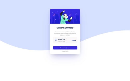
Desktop design screenshot for the Order summary component coding challenge

This is a solution for...

  • HTML
  • CSS
1newbie
View challenge

Design comparison


SolutionDesign

Solution retrospective


how to add button shadows in proceed payments?

Community feedback

lr6kidy 280

@lr6kidy

Posted

Hi!

I think the spreadSizes of your button's box-shadow (the fourth value, in your case, -30px and -20px) are way too low considering the size of your button. Try 0, and chances are a shadow will appear, you can then change it from there.

Also, don't forget there are active states to the buttons and the "change" link. And you can set the background-color of the body to the light blue color listed in the style guide so that underneath the wave isn't white, and it matches the design.

Good luck!

0

Mo 840

@MohamedAridah

Posted

Hello ,

  • for .parent you need to add background-color property to to add background for the element and make it like the design.

  • for .parent there is no need to use fixed height. height: 560px.

  • for .parent to make the waves illustration looks closer to the design you can change background-size property to 100% instead of cover. or you can remove background-size property at all. you cab read about background-size from Here.

  • So after all this changes to the .parent it's styles will be like this:

.parent {
    display: grid;
    place-items: center;
    min-height: 100vh;
    background: #e0e8ff url(../images/pattern-background-desktop.svg) no-repeat;
}
  • for .container you can remove margin-top property if you want the card to be perfectly centered.

  • Don't use fixed height let content itself determine it's height. so you can remove height: 335px for .card-content div

  • for card-title instead of using <h2> heading level use <h1> heading level instead. This will fix your Accessibility issues as well.

  • when you use width: 80% instead of using margin-left or margin-right to center the content . You can just use margin: auto.

  • use font-family globally in the body for example instead of redeclare it for each element

  • .pay and .cancel have common styles so you can combine them in one class and add it to them instead of redeclare it again.

  • for your question you can see My solution for this challenge it may be helpful for you..!

I hope this wasn't too long for you, hoping also it was useful😍.

Goodbye and have a nice day.

Keep coding🚀

0

Please log in to post a comment

Log in with GitHub
Discord logo

Join our Discord community

Join thousands of Frontend Mentor community members taking the challenges, sharing resources, helping each other, and chatting about all things front-end!

Join our Discord