Not Found
Not Found
Not Found
Not Found
Not Found
Not Found
Not Found
Not Found
Not Found
Not Found
Not Found
Not Found
Not Found
Not Found
Not Found
Not Found
Not Found
Not Found
Not Found
Not Found

Submitted

order-summary-component-main using HTML and CSS

Nour Wael 110

@NourWaell

Desktop design screenshot for the Order summary component coding challenge

This is a solution for...

  • HTML
  • CSS
1newbie
View challenge

Design comparison


SolutionDesign

Solution retrospective


Feel free to tell me about the mistakes you see, and give me an advice to make it better. I would really appreciate your help.

Community feedback

Lucas 👾 104,560

@correlucas

Posted

Hello Nour! Congratulations for your solution!

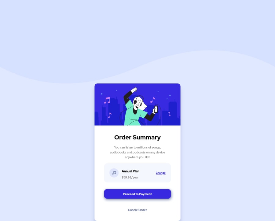
I saw your live site and I'll give you some tips to apply and fix it:

1.You add the background-image as <img> its better you import this image using the css inside the body class. Delete the tag <img> from the html and also the class .back from the css sheet. Use this property in the body background-image: url(/images/pattern-background-desktop.svg);

2.Set your body as flexbox to align the card to the screen center and 'height:100vh' to make the body displays all the viewport height, code below:

body { display: flex; flex-direction: column; align-items: center; justify-content: center; height: 100vh; }

2.Fix the container, using again flex and max-width instead of width (for a flexible container) and flex-direction: column to change the content flow vertically.

.container { display: flex; max-width: 450px; flex-direction: column; }

I applied this modification in devtools and now your solution works, try to do it and say me if fixes your code.

I hope it helps you and happy coding!

Marked as helpful

1

Nour Wael 110

@NourWaell

Posted

@correlucas Thank you this was so helpful!

0

Account Deleted

Hey Nour, congratulations you did a great job 😉

Let me give you some little tips for optimizing your code:

  • add main tag and wrap the card for improve the Accessibility
  • add descriptive text in the alt attribute of the images
  • remove margin from container class because with flex they are superfluous
  • use min-height: 100vh instead of height to body
  • add transition on the element with hover effect
  • instead of using px use relative units of measurement like rem -> read here

Hope this help and Happy coding 😁 by Travolgi

Marked as helpful

0

Please log in to post a comment

Log in with GitHub
Discord logo

Join our Discord community

Join thousands of Frontend Mentor community members taking the challenges, sharing resources, helping each other, and chatting about all things front-end!

Join our Discord