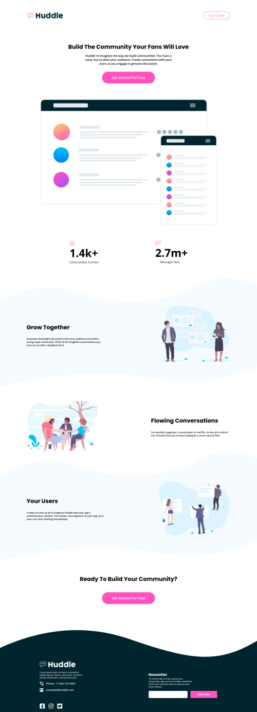
Page responsive with HTML e CSS to Desktop, Tablet and Mobile

Solution retrospective
(PT-BR) Feliz por completar meu primeiro desafio nivel Junior e não achei difícil, porém achei que meu CSS ficou bem extenso e meu HTML talvez só eu entenda 😅 ainda irei organiza-lo.
(EN) Happy to complete my first Junior level challenge and it wasn't difficult, but I thought my CSS was too long and my HTML maybe only I understand 😅 I'm still going to organize it.
Please log in to post a comment
Log in with GitHubCommunity feedback
- @correlucas
Fala Bruno, beleza? Parabéns pelo primeiro desafio junior!
Cara acabei de olhar sua solução e não tenho mto a dizer, tá tudo mto bom, uma coisa que se vc vai ajudar mto é uma classe de container pra alinhar todas sections ao centro, geralmente vc pode colocar um valor padrao de
max-width: 1110pxemargin: 0 autopra forçar o alinhamneto de todos ao centro.O header desktop está desalinhado ao centro, pra arrumar isso basta um
align-items: centere ummargin: 0 autopra forcar a centralizacao..header { width: 100%; max-width: 1440px; gap: 30rem; display: flex; margin: 0 auto; align-items: center; justify-content: center; padding: 4rem 0; }Fazendo isso vc vai ver que ele centraliza.
Espero ter ajudado e continue no foco, vc ta fazendo varios desafios avancados eu ainda nem fiz esses.
Marked as helpful

Join our Discord community
Join thousands of Frontend Mentor community members taking the challenges, sharing resources, helping each other, and chatting about all things front-end!
Join our Discord