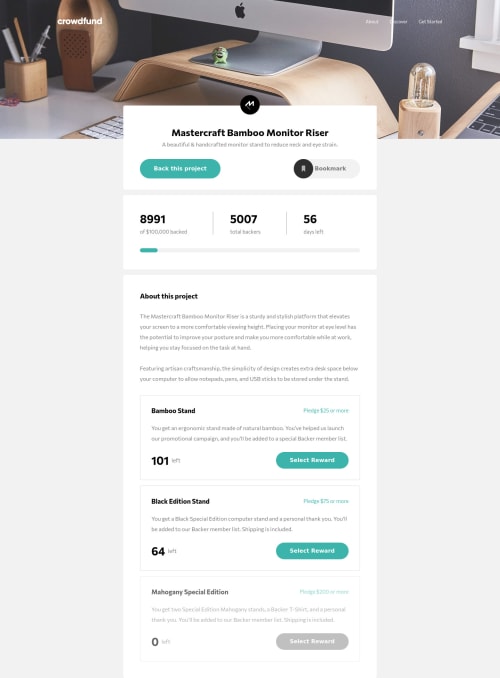
Not Found
Not Found
Not Found
Not Found
Not Found
Not Found
Not Found
Not Found
Not Found
Not Found
Not Found
Not Found
Not Found
Not Found
Not Found
Not Found
Not Found
Not Found
Not Found
Not Found

Submitted

parcel, netlify

kevin• 415

@imonaar

Desktop design screenshot for the Crowdfunding product page coding challenge

This is a solution for...

  • HTML
  • CSS
  • JS
2junior
View challenge

Design comparison


SolutionDesign

Solution retrospective


This is the longest project i have done, so far. Lot of Learning and unlearning. This was done desktop first (which i later realised was a mistake)

comments:

  1. Still a work in progress, yet to completely fix accesibilty.

  2. Cooordinating the modals was a bit of a challenge, that is why the js is messy.

  3. Still on working on focusing on the modal the specific pledge selected.

  4. working on using localstorage to persist the state.

comments and corrections are welcome on how I could have done better.

Community feedback

Shashi Lo• 1,345

@shashilo

Posted

This is a great start Kevin. It definitely looks the part, but can use some touchup. Knowing how particular designers and some companies ware with being pixel perfect, here are some suggestions:

  • Download an image overlay plugin like PixelParrallel. It allows you to see where you're a little off in certain areas based on the design mock ups.

  • Modals background should be darker.

  • Modal options should allow the user to click the entire block to select the option instead of the radio button. This will increase UX and conversion.

  • You did a great job centering the modals!

  • Mobile modal starts in the center of the modal and not the top.

  • Mobile font size and line-height seems off. Definitely the main__wrapper.

  • Mobile menu should have a more subtle transition on open/close.

  • Mobile menu <a> should expand the entire width for it's click state. Increases UX/UI.

  • Make sure logo links to homepage.

  • Instead of using media queries to adjust the mobile screen, build your CSS mobile first. On a slow mobile phone, you do not want the user's device to work twice as hard to render styles. But on Desktop, the user is most likely using a fast internet connection and can handle the additional media queries.

Marked as helpful

3

kevin• 415

@imonaar

Posted

@shashilo Thank you for this great Feedback. definitely implementing this as I am still working on the project.

0

Please log in to post a comment

Log in with GitHub
Discord logo

Join our Discord community

Join thousands of Frontend Mentor community members taking the challenges, sharing resources, helping each other, and chatting about all things front-end!

Join our Discord