Skip to content
  • Unlock Pro
  • Log in with GitHub
Solution
Submitted almost 5 years ago

Flexbox Galore

Cara Uymatiao•75
@carauymatiao
A solution to the Fylo data storage component challenge
View live sitePreview (opens in new tab)View codeCode (opens in new tab)

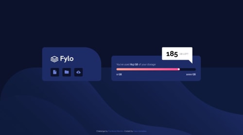
Solution retrospective


Change logs:

v2.0: Still have to fix flex boxes so they aren't a static size.

v2.1:

  • Flex box fixed.
  • Landscape display not accounted for. White box may cover attribution text.

v2.2:

  • Removed footer div and finally placed image as body bg
  • Fixed landscape orientation problems by converting the whole thing into a flex box
Code
Select a file

Please log in to post a comment

Log in with GitHub

Community feedback

  • Ovidiu-Antonio•3,125
    @ovidiuantonio
    Posted almost 5 years ago

    Hello,

    Very nice solution; you did a really good job! Even if your boxes have a static size the site is very responsive! One thing you can do to the .progress-bar is to give it this properties: display: flex; and align-items: center; to align the gradient bar that it's inside it. Flexbox is a nice and easy way to align items and I use it pretty much everywhere.

    Happy coding! Keep going!

  • Shashi Lo•1,345
    @shashilo
    Posted almost 5 years ago

    Hey Cara. Looks like you were able to redo this using Flexbox. Great job! This implementation looks very much like the design too. I did find some areas that can improve:

    • .main should be 920px wide and the child containers should span the entire 920 width.
    • Remove the fixed height from .left-container. Allow this section to be fluid. This way if anything changed, it's easier to know where the fault is. If you inspect this element with browser dev tools, you'll see that the margin cuts the icons in half. Its true size is lost.
    • <div class="icon-bg"> has a hover state, but it's true clickable region is the <img>. For better usability, remove the div and move .icon-bg to <img class="icon-bg">. Less DOM elements, cleaner code, win-win.
    • .progress-bar-active should be 81.5% of the width.
    • Mobile looks great, but the left/right containers should have only 15px spacing between them.
  • Emmilie Estabillo•5,600
    @emestabillo
    Posted almost 5 years ago

    Hi Cara, great job with this challenge and figuring out flexbox! It’s responsive and pretty much adheres to the design. My only suggestion would be to place the desktop background on body, like you did with the mobile version. Then it's just a matter of positioning it at the bottom. It will give you the option to delete .footer , one less element to maintain. Hope this helps :-)

Join our Discord community

Join thousands of Frontend Mentor community members taking the challenges, sharing resources, helping each other, and chatting about all things front-end!

Join our Discord
Frontend Mentor logo

Stay up to datewith new challenges, featured solutions, selected articles, and our latest news

Frontend Mentor

  • Unlock Pro
  • Contact us
  • FAQs
  • Become a partner

Explore

  • Learning paths
  • Challenges
  • Solutions
  • Articles

Community

  • Discord
  • Guidelines

For companies

  • Hire developers
  • Train developers
© Frontend Mentor 2019 - 2025
  • Terms
  • Cookie Policy
  • Privacy Policy
  • License

Oops! 😬

You need to be logged in before you can do that.

Log in with GitHub

Oops! 😬

You need to be logged in before you can do that.

Log in with GitHub

How does the accessibility report work?

When a solution is submitted, we use axe-core to run an automated audit of your code.

This picks out common accessibility issues like not using semantic HTML and not having proper heading hierarchies, among others.

This automated audit is fairly surface level, so we encourage to you review the project and code in more detail with accessibility best practices in mind.

How does the CSS report work?

When a solution is submitted, we use stylelint to run an automated check on the CSS code.

We've added some of our own linting rules based on recommended best practices. These rules are prefixed with frontend-mentor/ which you'll see at the top of each issue in the report.

The report will audit 1st-party linked stylesheets, and styles within <style> tags.

How does the HTML validation report work?

When a solution is submitted, we use html-validate to run an automated check on the HTML code.

The report picks out common HTML issues such as not using headings within section elements and incorrect nesting of elements, among others.

Note that the report can pick up “invalid” attributes, which some frameworks automatically add to the HTML. These attributes are crucial for how the frameworks function, although they’re technically not valid HTML. As such, some projects can show up with many HTML validation errors, which are benign and are a necessary part of the framework.

Oops! 😬

You need to be logged in before you can do that.

Log in with GitHub

Oops! 😬

You need to be logged in before you can do that.

Log in with GitHub

Frontend Mentor for Teams

Frontend Mentor for Teams helps companies and schools onboard and train developers through project-based learning. Our industry-standard projects give developers hands-on experience tackling real coding problems, helping them master their craft.

If you work in a company or are a student in a coding school, feel free to share Frontend Mentor for Teams with your manager or instructor, as they may use it to help with your coding education.

Learn more

Oops! 😬

You need to be logged in before you can do that.

Log in with GitHub