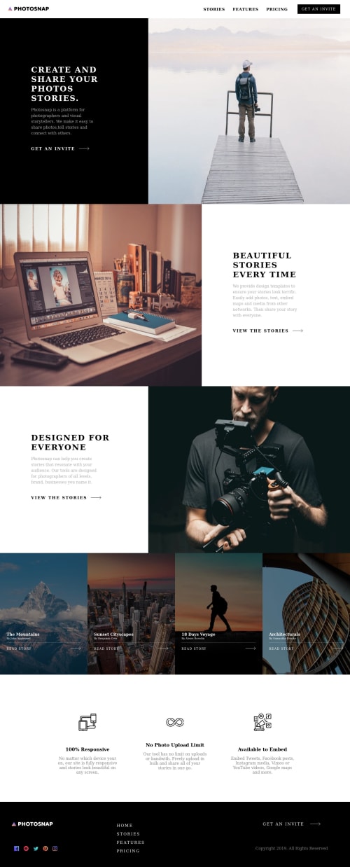
Submitted over 4 years agoA solution to the Photosnap multi-page website challenge
Photosnap Website

@trudihub
Solution retrospective
Hey everyone, I built this photosnap site with react and styled-components. Mainly used grid layouts. Any feedback is appreciated !
Code
Loading...
Please log in to post a comment
Log in with GitHubCommunity feedback
No feedback yet. Be the first to give feedback on trudihub's solution.
Join our Discord community
Join thousands of Frontend Mentor community members taking the challenges, sharing resources, helping each other, and chatting about all things front-end!
Join our Discord