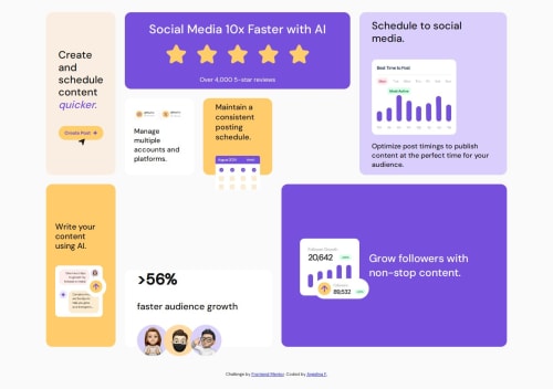
Piece-by-piece approach to a responsive Bento Grid layout

Solution retrospective
I’m really proud of how I planned things out and worked through the layout step by step. Taking it piece by piece—starting with the structure, then colors and text, and finally the graphics—helped me stay focused and not get overwhelmed. It made it easier to pay attention to the small details.
This was my first design-focused challenge where I had to match a layout using provided images, and I learned a lot about how to work with external assets and fine-tune styles to get things looking right.
If I were to do it again, I’d try using more tools to help with layout precision—like labeling cards temporarily or using dev tools more effectively—to make adjusting spacing and sizing a little smoother.
What challenges did you encounter, and how did you overcome them?The biggest challenge was getting the layout to match the design exactly, especially with spacing, card sizing, and layering. I had to go card by card and tweak things individually, constantly checking against the design reference. The mobile layout also took some trial and error to get it feeling clean without messing up the desktop view. I’m happy with how it turned out overall, but I still wish the desktop view had a slightly more perfect match with the white space and card dimensions.
What specific areas of your project would you like help with?I’d love feedback on how closely my layout matches the design, especially in the desktop view—some of the white space and card dimensions still feel a bit off to me.
Also curious:
When starting a project like this, do people usually focus on mobile-first or desktop-first, or bounce between the two?
I built this using just HTML and CSS (with a bit of Flexbox and Grid). I also have experience with Bootstrap—what would be a good next step to level up from here?
Please log in to post a comment
Log in with GitHubCommunity feedback
- @thisisharsh7
Great work on the Bento Grid challenge! Your systematic approach to building the layout step-by-step shines through, and using Flexbox and Grid shows a solid grasp of modern CSS.
-
For responsiveness, the mobile view works but feels abrupt due to the single-column switch at 768px. A more gradual approach, like a two-column layout at an intermediate breakpoint (e.g., 900px), could smooth the transition. Mobile-first is often preferred for simpler scaling, but desktop-first works if the design prioritizes desktop. Experiment with both to find what suits your workflow.
-
To level up, explore CSS preprocessors like SASS for better organization or try a framework like Tailwind for rapid styling. For precision, use browser dev tools to inspect pixel-perfect spacing.
-
Challenges like card sizing were well-handled by tweaking individually, but consider CSS
calc()for dynamic sizing.
Overall, a strong submission—focus on refining responsiveness and spacing for polish!
-

Join our Discord community
Join thousands of Frontend Mentor community members taking the challenges, sharing resources, helping each other, and chatting about all things front-end!
Join our Discord