Not Found
Not Found
Not Found
Not Found
Not Found
Not Found
Not Found
Not Found
Not Found
Not Found
Not Found
Not Found
Not Found
Not Found
Not Found
Not Found
Not Found
Not Found
Not Found
Not Found

Submitted

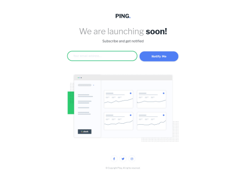
PING Coming Soon Page: Did I make it responsive and accessible enough?

P
Royā€¢ 195

@royschrauwen

Desktop design screenshot for the Ping single column coming soon page coding challenge

This is a solution for...

  • HTML
  • CSS
  • JS
1newbie
View challenge

Design comparison


SolutionDesign

Solution retrospective


Hello everyone! šŸ‘‹

I love doing all these challenges and finished another one, it's my ninth one! šŸŽ‰

I have been self-learing HTML and CSS since May 2021 and I want to become a developer, so any constructive criticism is very welcome. šŸ˜Š

ā“ļø Specific Questions ā“ļø

  1. I wanted to make this one as responsive as possible. I think I managed to do that, but please give me tips on how to improve or point out things where I did a good job.

  2. I tried to take accessibility into account when making this page. I have no experience with it, so please tell me what I did right and where I can improve.

Thank you very much for any support you can give me. I love all the small tips and tricks the community gives me. šŸ™

Have a nice day! šŸ™‹ā€ā™‚ļø

Community feedback

P
Graceā€¢ 27,710

@grace-snow

Posted

Hello

Great job on this, and really pleased to hear you're considering accessibility right from the start of your coding journey!

Please don't be discouraged by this list, you've done a good job on this challenge! But as an accessibility expert, I'll give you the most detailed feedback I can as you seem keen to learn this area :)

To make this truly accessible:

  • never use px for font sizes. (Convert to rem, or sometimes use em)
  • use rem everywhere where you might usually use px. This will allow the whole page to scale together if a user has different font/zoom settings
  • the logo is the most important content on the whole site, so never have empty alt value on there. alt="Ping"
  • Make focus-visible styles more obvious and consistent. They are different for input, button and link at the moment. Button focus is particularly hard to see
  • Rather than aria-label="Go to our Facebook page" all that would need to say is Facebook (opens in new window). This is already announced as a link so you don't need to include phrases like "go to..."
  • Optional - Better than aria-label would be to include visually hidden text inside the anchor tag. You could even give it an id and use aria-labelledby pointing to that ID. This is better than using aria-label, because aria-label cannot be accessed by translation API. So someone viewing the page in another language would still hear English on aria-label, but their own language on HTML text
  • Make those social icon links a little bigger. They are 32 x 32 at the moment, but recommended click target size is 40+
  • Don't use input type submit - that is legacy. Use a button with type submit instead
  • Optional - recommend using padding and/or min-width on the button to control its size rather than hard-coding in a width. On real projects you will get content editors writing in content, including buttons etc, so you don't want to limit how that button may need to grow/shrink. That's a general principle where min- or max- properties can lead to a more robust solution
  • It's great that you've used aria-live on the error message! Well done. To make that work fully you need to associate it to its input. Add aria-describedby to the input linking it to that error message ID
  • Rather than a hideMe class, why not use the HTML hidden attribute?
  • really important - the input is missing a label at the moment. It's best to put this in a label element that is visually-hidden
  • Font size on inputs needs to be 16px or IOS will zoom in when a user starts entering text. That's ok, but may not be desirable behaviour
  • Font size should never go smaller than 12px (equivalent in rem) for the smallest of smallprint. The paragraph text even on mobile should not be this small. It should be much closer to the default of 16px. If this challenge has 20px in the styleguide usually that is what is expected at mobile, but could be desktop. Either way, that's saying text should be larger than the default 16px.
  • Headings must go in order. So your success message needs a h2 not h3

Other general tips

  • try to style with classes not element selectors or nested selectors. CSS will be much more maintainable if you keep specificity really low
  • Try to use rem (or sometimes ch units with text) for max-widths. Remember huge screens and tiny screens (or landscape/prtrait orientations) can lead to unexpected results when using viewport units

I hope that's helpful! Good luck

Marked as helpful

3

P
Royā€¢ 195

@royschrauwen

Posted

Hi Grace šŸ‘‹

Thank you so much for your detailed feedback! I am certainly not discouraged, in fact I am motivated to improve. And your comprehensive list helps me a lot. šŸ’Ŗ

I figured that since I am starting to learn frontend, I better do it the best I can and make accessibility part of my routine.

I tried to implement as much of your suggestions as possible. I hope most of the changes I made were an improvement.

Thank you so much for the help and encouragement šŸ™

0
Brian Farmerā€¢ 210

@brianlfarmerllc

Posted

I think the responsiveness and accessibility is great. The form is keyboard accessible and the use of a tags lets you tab through all the links in the footer.

Not sure if you are familiar with it but the lighthouse tool in google chrome dev tools can give you great insight to the accessibility areas that need to be improved on in projects. I use it a lot. Firefox dev tools also have a great accessibility tool. Though i'm still learning how to use it myself.

Great Job!

Marked as helpful

2

P
Royā€¢ 195

@royschrauwen

Posted

Hi @brianlfarmerllc šŸ‘‹,

Thanks for your feedback!

I will check out the Lighthouse Tool in Google Chrome Dev Tools. I should make a list with tools like that, for checking my solutions.

Have a nice day! šŸ™‹ā€ā™‚ļø

0

Please log in to post a comment

Log in with GitHub
Discord logo

Join our Discord community

Join thousands of Frontend Mentor community members taking the challenges, sharing resources, helping each other, and chatting about all things front-end!

Join our Discord