


@jerry-the-kid
Posted
Hi Yesim. Your web works great in desktop but there are some things to avoid like using margin left like 22rem. It's not good practice in responsive, what if your screen really big (the input and the picture will only on the left and remain big space in the right) and what if your screen like in tablet or mobile ( it will overflow outside the screen or it will on the left only ).
My solution it you do like you usually do like set width and max-width and margin 0 auto so the item in center. I usually do that to. And for helper text you should use left : 10% or so replace to margin-left.
Marked as helpful
@ysmltr
Posted
@jerry-the-kid hi man! I know it's not a good choice, but I use this style: "justify-content: center; " I hope it's better what do you think about this
thank's for feedback again!
@jerry-the-kid
Posted
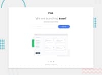
Hi @ysmltr, It look great but your input sink too fast because you set input width = 40% and button 10%. For an example you can set input like width: 80%; max-width: 450px; ( so in large screen it took 450px, and small screen it took 80%).
My recommend method is set button-group max-width and width and make it center using margin : 0 auto. Then the input i set it to 70% and button 30% something like that (or other modern way is set flex in button-group and input flex-grow and input set flex-basis on button 100px or something).
and i notice your border not showing correctly. Please remove border-radius: 2rem solid black, and divide it to 2 attribute like : border-radius : 2rem, border : 1px solid red, or something like that.
I’m glad I could help. I’ll happily do it again, too. Just let me know if you have any problems.
Marked as helpful

