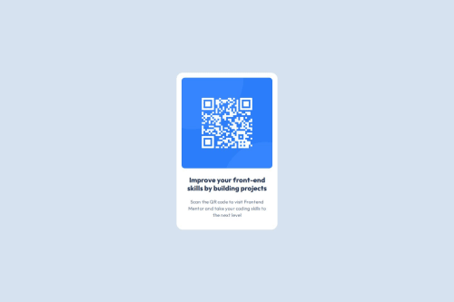
Pixel-Perfect QR Code Component with Clean Flexbox Layout

Solution retrospective
I’m most proud of how clean and precise the final design turned out—matching the challenge’s layout and styling took more focus than I expected, and I nailed that attention to detail. Also, leveling up my README game with a solid, well-structured doc feels like a win for future projects.
What challenges did you encounter, and how did you overcome them?Honestly, this one wasn’t super challenging since I was already comfortable with the core concepts. The main hurdle was getting the design pixel-perfect — matching spacing, font sizes, and colors took way more trial and error than coding itself. I overcame it by zooming in, double-checking specs, and tweaking CSS repeatedly until it felt just right.
Also, figuring out how to write a clear README was new territory, but using the provided template made it way easier to structure my thoughts.
What specific areas of your project would you like help with?Since this project was pretty straightforward, I’m mainly looking for feedback on subtle design details—like whether my spacing, typography, and color choices match the original challenge as closely as possible. Also, any tips on writing clearer, more professional README documentation would be super helpful.
If you spot any ways I could improve my CSS structure or overall workflow, I’m all ears!
Please log in to post a comment
Log in with GitHubCommunity feedback
No feedback yet. Be the first to give feedback on Sandip Tamang's solution.
Join our Discord community
Join thousands of Frontend Mentor community members taking the challenges, sharing resources, helping each other, and chatting about all things front-end!
Join our Discord