


Tereza• 605
@sirriah
Posted
Hello Artur, nice work! I look at your code - I see you use different files for mobile and tablet view. I think that is better to use media queries under every tag separately. You should write mobile first, so you can start write css for mobile view and then you use min-width for tablet and then for desktop. It will work faster on mobile devices. Look at this nice tutorial for inspiration.
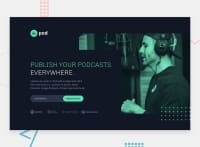
I miss some container for desktop which is greater than 1440px. Your design doesn't stop stretch and it looks weird.
Welcome to the PRO! Happy coding! I look forward to your next challenge.
0
