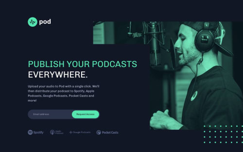
Pod request access landing page using CSS Flexbox and vanilla JS

Solution retrospective
This is my first premium challenge. It was quite interesting. I decided to use absolute positioning for the decorations and also the error message in order to prevent the podcast icons from shifting on larger viewports.
In terms of accessibility, how do you think the form validation looks? Would it be better to also include attributes such as aria-invalid and aria-required?
The design did not include a "success" state for submitting the form, so I went with a simple alert that displays the submitted email address. This is only for demonstration purposes, as there is probably a better solution for showing a success state.
Please log in to post a comment
Log in with GitHubCommunity feedback
No feedback yet. Be the first to give feedback on Wessel Konstantinov's solution.
Join our Discord community
Join thousands of Frontend Mentor community members taking the challenges, sharing resources, helping each other, and chatting about all things front-end!
Join our Discord