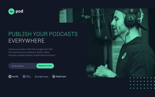
Pod-request-access-landing-page

Solution retrospective
If anybody would like to review my code and give me feedback that would be great!
Any other type of feedback is appreciated as well! Thank You!
Please log in to post a comment
Log in with GitHubCommunity feedback
- @DrKlonk
Hi Otman,
I was browsing through the solutions for this challenge and went back a long time to see how others fixed it.
So this advice is a bit late, but better late than never.
- The green dots are continously moving. Is that on purpose? I find it quite distracting.
- You can import the svgs just like you normally would in the
<img>tag, in the src attribute. That way, you can keep your html a bit cleaner. - You could make the podcast logos a bit nicer by not giving them height and width of 100%, but creating a lexbox and aligning them in the center. Then the google podcasts logo wouldn't look stretched. Because now, they all get the same height. Fiddling around with the margin is not the way to go.
- The error message is in a different font (Times) and the input field as well (Arial). That is a bit strange, you can just use the same as the text. I think that would be nicer.
All in all, nice job! The responsiveness works well.
Cheers, Joran
Join our Discord community
Join thousands of Frontend Mentor community members taking the challenges, sharing resources, helping each other, and chatting about all things front-end!
Join our Discord