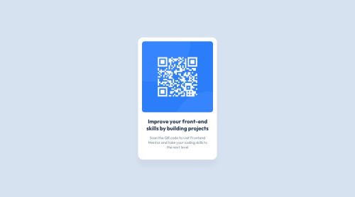
Submitted almost 2 years agoA solution to the QR code component challenge
Power of display flex!

@IonCatana
Solution retrospective
All feedback is welcome and appreciated.
Code
Please log in to post a comment
Log in with GitHubCommunity feedback
- @mayankdrvr
Congratulations Ion for completing this challenge. Your design matches the solution very well.
Here are a few observations-
- Below 363px width of screen, the text and card gets partially hidden, the text does not wrap and the image does not resize. Maybe, you can make it more responsive by setting the maximum width of card to be upto 100% of width of its parent container. See if using this CSS property in image styling can make the image more responsive-
max-width: 100%; - It is good practice to use semantic html elements for better web accessibility instead of simply using <div> tags.
- Try to use the Block Element Modifier(BEM) naming method as a good practice of naming classes for referencing html elements in the css file.
- Google Fonts provides the option to load fonts via <link> tags or an @import statement. The <link> code snippet includes a preconnect resource hint and therefore will likely result in faster stylesheet delivery than using @import version. Importing google fonts in the html head section is a good practice instead of importing them in the css file-
<head>
<link href="https://fonts.googleapis.com/css2?family=Big+Shoulders+Display:wght@700&family=Lexend+Deca&family=Outfit:wght@400;700&display=swap" rel="stylesheet">
</head>
Updated CSS styling of html elements for a more responsive design(changes in comments)-
/* @import url('https://fonts.googleapis.com/css2?family=Outfit:wght@400;700&display=swap'); */

.container {
  width: var(--site-width);
  min-height: 100vh;
  /* makes container responsive */
  margin: 0 auto;
  background-color: var(--light-gray);
  max-width: 100%;
  display: flex;
  justify-content: center;
  align-items: center;
}

.card .img {
  margin-bottom: 24px;
  max-width: 100%;
  /* makes image responsive */
}

.card .img img {
  width: 100%;
  height: 100%;
  object-fit: cover;
  border-radius: 1rem;
  /* adds image borders */
}
Awesome solution and keep it up.
Marked as helpful - Below 363px width of screen, the text and card gets partially hidden, the text does not wrap and the image does not resize. Maybe, you can make it more responsive by setting the maximum width of card to be upto 100% of width of its parent container. See if using this CSS property in image styling can make the image more responsive-
- @IonCatana
I am not sure, but for some reason, the font family appears to be different. Is there a bug???

Join our Discord community
Join thousands of Frontend Mentor community members taking the challenges, sharing resources, helping each other, and chatting about all things front-end!
Join our Discord