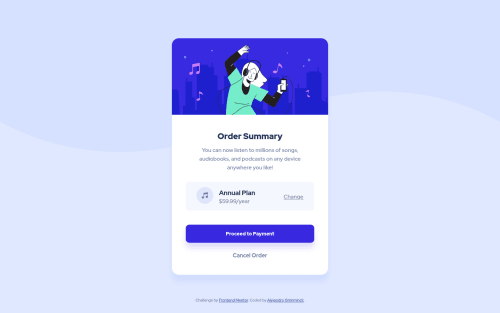
Submitted almost 4 years agoA solution to the Order summary component challenge
Practicing BEM

@alegrimminck
Solution retrospective
Hello guys! Any recommendation will be fully aprecciated, just trying to get the hang of it :)
Code
Please log in to post a comment
Log in with GitHubCommunity feedback
- @elidrissidev
Looks very close to the design, great job!
I do have some suggestions for you:
- When you submit a solution, try to take a look at the reports page as it helps you identify accessibility and semantic issues with your HTML.
- Speaking of semantics, you could have used some semantic elements instead of generic
divs. E.g: You could wrap.attributionwith afooterelement, and you could also make.cardamainelement or wrap it in one. These are called landmark elements and they help create a hierarchy of the page for things like screen readers. - Avoid skipping heading levels. You've used an
h1for "Order Summary" but you skippedh2and used anh3for "Annual plan". Heading levels help define a content hierarchy for your page, always go from 1 to 6. - Since you are practicing BEM methodology, I saw that you were using long class names for nested elements, you could simplify it by flattening it: http://getbem.com/faq/#css-nested-elements
Good luck!

Join our Discord community
Join thousands of Frontend Mentor community members taking the challenges, sharing resources, helping each other, and chatting about all things front-end!
Join our Discord