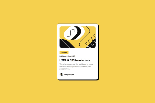
Skip to content
  • Unlock Pro
  • Log in with GitHub
Solution
Submitted about 1 year ago

Preview Card for a Blog!

BegShoo•80
@BegShoo
A solution to the Blog preview card challenge
View live sitePreview (opens in new tab)View codeCode (opens in new tab)

Solution retrospective


What are you most proud of, and what would you do differently next time?

Managed to figure out most of it on my own, only had to go back and check my lesson notes and other projects for the tag and a few other little bits.

What challenges did you encounter, and how did you overcome them?

Layouts mostly but the Figma file was very useful.

What specific areas of your project would you like help with?

Just checking everything is done reasonably right, and that I didn't use the wrong method but the right results for anything!

Code
Select a file

Please log in to post a comment

Log in with GitHub

Community feedback

  • Koda👹•3,830
    @kodan96
    Posted about 1 year ago

    hi there! 👋

    A couple of tips:

    HTML:

    • all of your content within the body should be contained by landmarks. these landmarks are the header, main and footer HMTL elements. for a project like this use at least a <main> tag

    • all HTML documents need an h1 tag (one and only one) and you shouldn't jump levels. so h1 should be followed by h2, that can be followed by 1 or more h3 elements, and when you start your next section you can go back to h2. you can think of it like h1 is the title of the page, h2-s are the title of the sections, h3-s are subtitles for the h2 elemetns etc.

    CSS:

    • don't use the 62.5% font-size hack, it will cause accessibility issues on your page

    • don't apply width or height to your elements explicitly, it kills responsiveness. containers will adapt to their content by default. if you want to define a range of width use width and max-widht:

    .element {
      width: 90%;
      max-wdith: 55rem; 
    }
    

    here .element will take up 90% of the container's width, but won't expand over 55rem

    • declaring max-width: 100vw; on the body is not necessary, it will take up the entire width of the viewport by default.

    • centering your content with margin is not the best idea, you can apply these to the body tag to achieve the centering:

    body {
      min-height: 100vh;
      display: flex;
      justify-content: center;
      align-items: center;
    }
    

    if you have multiple elements you should also include flex-direction: column;

    Hope this was helpful 🙏

    Good luck and happy coding! 🙌

    Marked as helpful

Join our Discord community

Join thousands of Frontend Mentor community members taking the challenges, sharing resources, helping each other, and chatting about all things front-end!

Join our Discord
Frontend Mentor logo

Stay up to datewith new challenges, featured solutions, selected articles, and our latest news

Frontend Mentor

  • Unlock Pro
  • Contact us
  • FAQs
  • Become a partner

Explore

  • Learning paths
  • Challenges
  • Solutions
  • Articles

Community

  • Discord
  • Guidelines

For companies

  • Hire developers
  • Train developers
© Frontend Mentor 2019 - 2025
  • Terms
  • Cookie Policy
  • Privacy Policy
  • License

Oops! 😬

You need to be logged in before you can do that.

Log in with GitHub

Oops! 😬

You need to be logged in before you can do that.

Log in with GitHub

How does the accessibility report work?

When a solution is submitted, we use axe-core to run an automated audit of your code.

This picks out common accessibility issues like not using semantic HTML and not having proper heading hierarchies, among others.

This automated audit is fairly surface level, so we encourage to you review the project and code in more detail with accessibility best practices in mind.

How does the CSS report work?

When a solution is submitted, we use stylelint to run an automated check on the CSS code.

We've added some of our own linting rules based on recommended best practices. These rules are prefixed with frontend-mentor/ which you'll see at the top of each issue in the report.

The report will audit all CSS, SCSS and Less files in your repository.

How does the HTML validation report work?

When a solution is submitted, we use html-validate to run an automated check on the HTML code.

The report picks out common HTML issues such as not using headings within section elements and incorrect nesting of elements, among others.

Note that the report can pick up “invalid” attributes, which some frameworks automatically add to the HTML. These attributes are crucial for how the frameworks function, although they’re technically not valid HTML. As such, some projects can show up with many HTML validation errors, which are benign and are a necessary part of the framework.

How does the JavaScript validation report work?

When a solution is submitted, we use eslint to run an automated check on the JavaScript code.

The report picks out common JavaScript issues such as not using semicolons and using var instead of let or const, among others.

The report will audit all JS and JSX files in your repository. We currently do not support Typescript or other frontend frameworks.

Oops! 😬

You need to be logged in before you can do that.

Log in with GitHub