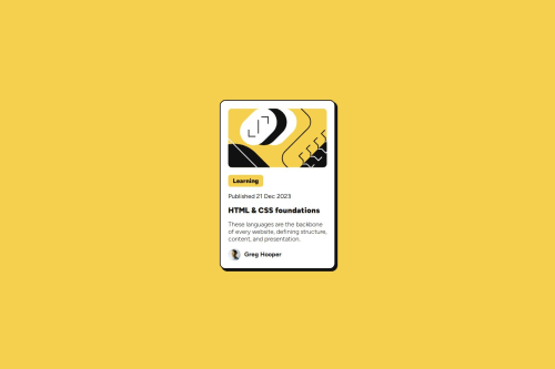
Preview Card – Responsive Design with HTML & CSS

Solution retrospective
I'm most proud of creating a fully responsive solution using only HTML and CSS without needing JavaScript. Using media queries and design techniques like Flexbox and Grid really allowed me to make the layout flexible and easy to adapt. Next time, I could further optimize the image structure or add subtle animations to improve interactivity.
What challenges did you encounter, and how did you overcome them?One of the biggest challenges was making sure the card looked good on both small and large screens. To overcome this, I focused on a mobile-first approach, adjusting sizes and alignments as I scaled the design. I also had to tweak margins and spacing to prevent elements from overflowing on smaller screens.
What specific areas of your project would you like help with?’d love feedback on how I could optimize the performance of images, as image size is important in a responsive design. Additionally, I’d like to know if there are ways to make the design more accessible or improve the semantic structure of the HTML.
Please log in to post a comment
Log in with GitHubCommunity feedback
- @CarlosLDC
- Lo único que no me gusta es que la escala de tu solución es diferente. Pero eso no es muy importante.
- Yo también pensé usar flex en la parte del usuario, pero me terminé decantando por inline-block. ¿Puede que flex sea una solución más elegante? Creo que sí.
- Me doy cuenta de que también usas código DRY (cuando definiste el margen de base). Creo que esta herramienta es muy útil para los tipos y tamaños de fuente.
Marked as helpful

Join our Discord community
Join thousands of Frontend Mentor community members taking the challenges, sharing resources, helping each other, and chatting about all things front-end!
Join our Discord