Not Found
Not Found
Not Found
Not Found
Not Found
Not Found
Not Found
Not Found
Not Found
Not Found
Not Found
Not Found
Not Found
Not Found
Not Found
Not Found
Not Found
Not Found
Not Found
Not Found

Submitted

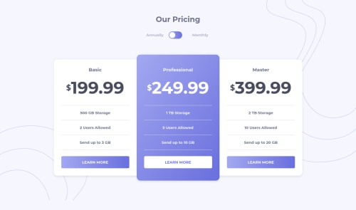
Pricing Component with Toggle, featuring JS

Lesley Wesleyโ€ข 345

@LesleyWesley

Desktop design screenshot for the Pricing component with toggle coding challenge

This is a solution for...

  • HTML
  • CSS
  • JS
2junior
View challenge

Design comparison


SolutionDesign

Solution retrospective


Hey guys! Open to any feedback, as usual! :)

Community feedback

Yashasvi Singhโ€ข 235

@Yashasvi2704

Posted

Hi Lesley,

Amazing work. The issue @Aman brought up is also present in my recent solution and looking it up I found it can also be solved if :

  1. You already apply a transparent border to the button and have a colored border on hover.

  2. You could use box-shadow property to set an "inset" border (one which lies inside the button box) on the hover state.

"box-shadow: 0px 0px 0px 1px white inset;"

Marked as helpful

0
Aman Patilโ€ข 885

@Amanpatil-Dev

Posted

Hello Lesley๐Ÿ–๏ธ, You did an amazing job ๐Ÿ‘Œ. your solution looks good and responds Great.

The only issue I found was when we hover the learn more button the corresponding pricing card perform something called content shifting or to be more preciously Layout Shifting

it is happening because you specified border of 1px when user hover over the button

.basic a:hover, .master a:hover { color: #696FDD; border: 1px solid #494C5F; background: #FFF; }

The solution to this would be simple just remove border property from the code above

and add border: 1px solid; to your a <tag>

That's All๐Ÿ‘

Hope this helps๐Ÿ™‚

Marked as helpful

0
P
Graceโ€ข 27,870

@grace-snow

Posted

Hey

There are a couple of issues I spot on this straight away I'm afraid

  • things are off center / have horizontal scroll on mobile (minor issue, but thought it worth mentioning)
  • the toggle ball seems to land slightly outside its wrapper when clicked
  • you have an empty label and inaccessible toggle at the moment (much more important issue)

I would always use radio inputs for this type of toggle, because it has two clearly defined and labelled states, where one is always active. If you're going to use a checkbox version for this, that's a bit strange to be displaying two options (monthly annually), as only one of them can represent the 'checked' state. To use a checkbox and make this accessible, you'd need to have whichever word is the checked state as the label, or you would need to change an aria-label on the input and announce the change of state with a dynamically added aria-live alert to tell the user which pricing model has been chosen. That's all a lot more work than just using a fieldset with radios ๐Ÿ˜‰

Hope that gives you things to think about and helps. Good luck with it

Marked as helpful

0

Please log in to post a comment

Log in with GitHub
Discord logo

Join our Discord community

Join thousands of Frontend Mentor community members taking the challenges, sharing resources, helping each other, and chatting about all things front-end!

Join our Discord