


@AgataLiberska
Posted
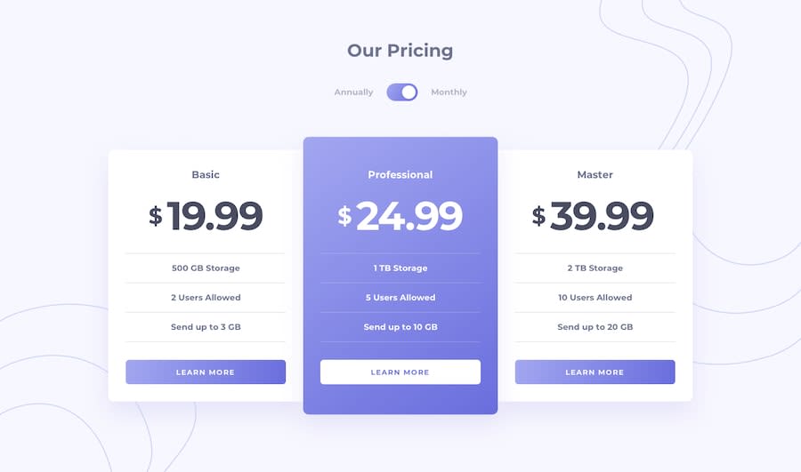
Hi @handleryouth! Your solution looks good, well done! Only on smallest mobile sizes the content of the cards overflows the cards themselves, and the toggle is really small, would be good if it got resized for smaller screens maybe. And the middle card still has a bigger padding on mobile, not sure if that's a part of the design or not.
Make sure that you don't leave the inputs without a <label> or an aria-label. It could also use some focus styles, the outline shouldn't really be removed without providing an alternative.
I would also change the <h1> elements where you have the different prices to a different element, not a heading. You should only have one <h1> per page, and the rest of headings should make sense in the hierarchy of the page.
Hope this helps, let me know if anything needs more explanation and I'll do my best to help :)
Marked as helpful
