Product card design using HTML and CSS.

Solution retrospective
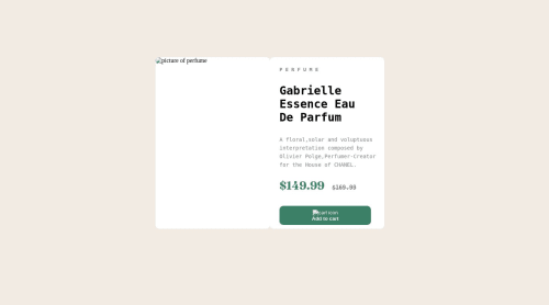
I still have no idea why any of my pictures won't load on the website. I also don't know why the font-family didn't work on the brand name (I removed it before uploading it) and I don't know how to place the cart icon on the button next to the text in a proper manner so any tips would be appreciated :)
Please log in to post a comment
Log in with GitHubCommunity feedback
- @OniOdd
Hi! :)
Your images are not displayed because you entered the wrong path to them. You have specified the path to the
images/folder, but the images are right next to theindex.htmlfile.Wrong path:
images/image-product-desktop.jpgRight path:
./image-product-desktop.jpgA font family is not displayed because it is overwritten by another font family. You have placed text in the
pretag, which has its own font,monospace. Therefore, you should apply thefont-familyproperty directly to thepretag to overwrite its default font. Also, those fonts that were connected externally (google fonts), their name must be in quotes:font-family: "Montserrat", sans-serif;font-family: "Fraunces", serif;To center an image with text, you need the Flexbox. Here's a mini-game that will help you learn how to use this property:
https://flexboxfroggy.com/Good luck! :)
Marked as helpful - @Jakub-Gryczka
Hi!
1.As someone above me mentioned about the images. You're pointing to the
images/folder where all your images would be, but you didn't uploaded this folder into Github. That's why the images aren't showing. You should do path eitherimage-product-desktop.jpgor upload the images folder to github and move all of the assets into that folder. This should work.2.The font-family isn't working for brand name because the text is in
<pre>tag, which has different font and isn't inheriting it by default. Just set thefont-family: inheriton the<pre>and it would work :D.3.To place the image next to the text I would recommend using Flexbox. Use it on the parent element (in your case on
the-button). Moreover you could perfectly center those items. It would be like that:.the-button { display: flex; justify-content: center; align-items: center; gap: 1em; }display: flexsets the display to flex, allowing you to use flexbox on this item.justify-contentallows you to justify the items along main axis which is x-axis (from left to right in this case)align-itemsallows you to align items along cross axis, which is y-axis (from top to bottom again, in that case)gapas the name shows, creates a gap between flex-items. You could also use it ongridelements. You should learn flexbox, so those properties will be clear, I just wrote some simplification for you to understand why those things happens.
4.After opening the website, the main part of website isn't in the center. It's aligned with hard-coded
margin-topandmargin-left. Again, better solution for this is flexbox. Add those lines to make it perfectly centered:body { display: flex; justify-content: center; align-items: center; min-height: 95vh; }min-heightis a property for minimum height of an element. In this case,95vhand thevhstands forviewport height, so of the screen height.Also, there's some HTML semantics lacks, I recommend Kevin Powell's latest video on YouTube: https://www.youtube.com/watch?v=K_EVuLegRZ0&t=875s
Hope it helps!
Marked as helpful


Join our Discord community
Join thousands of Frontend Mentor community members taking the challenges, sharing resources, helping each other, and chatting about all things front-end!
Join our Discord