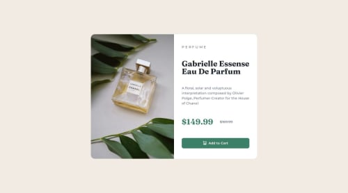
Product Card

Solution retrospective
The process was quiet linear. I've, first, set HTML structure. Then I've added all the basic CSS like variables for fonts, colors, background-colors, font-families etc, then matched CSS selectors with all the classes I've given while writing HTML
I've been stuck for a while when trying to make the right side of the product card be spread (in height) within its container. I've also been stuck when trying to make both sides take 50% of the main container when screen width is more than 600px. The problem was that I've set max-width: 100% for image to fill its container, that's why it wouldn't scale when setting main container as a flex container. So, I had to overwrite it in media-query.
Please log in to post a comment
Log in with GitHubCommunity feedback
No feedback yet. Be the first to give feedback on 01JohnnyJohn's solution.
Join our Discord community
Join thousands of Frontend Mentor community members taking the challenges, sharing resources, helping each other, and chatting about all things front-end!
Join our Discord