Skip to content
  • Unlock Pro
  • Log in with GitHub
Solution
Submitted 10 months ago

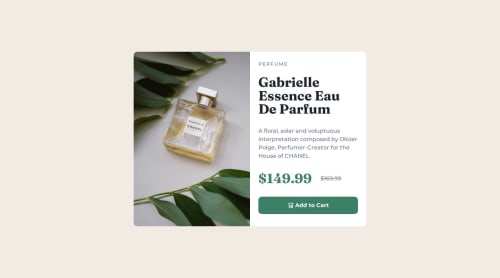
Product card |HTML & CSS|

Abhi•510
@abhi-zero
A solution to the Product preview card component challenge
View live sitePreview (opens in new tab)View codeCode (opens in new tab)

Solution retrospective


What are you most proud of, and what would you do differently next time?

This is the first time I am using Grid in CSS. Before this project, I always used Flexbox. It's easier for me to use Flexbox, but Grid is also good for dividing a section equally. It's not easy, but I think it's good to learn about Grid because it's so useful. From now on, I’m going to work with grids.

What challenges did you encounter, and how did you overcome them?

Working with grids is the toughest challenge for me, but it's worth it.

Where am I stuck on a problem? -The main problem I encounter is that the content section overflows out of the right column and goes to the bottom.

How do I overcome this problem? -Honestly, I used ChatGPT, but this problem was solved after five prompts."

Code
Loading...

Please log in to post a comment

Log in with GitHub

Community feedback

  • Alex•120
    @CaplexW
    Posted 10 months ago

    Hello Abhi! You did a great job! Here's some minor adjestments I wanted to advice, that might improve your work in the future:

    1. Try to avoid setting width and height in px. The reason is - it is an absolute units and it will make maintaining responsivness of you site much harder. Instead you can use responive units like em and rem. You can dive deeper in the topic in this article.
    2. Try to avoid setting specific height to content elements at all costs. Setting any specific height (in px or rem) will mostly likely kill the responsivnes of you site. You can pickup some good practices of working with height in this Web Dev Simplified video.
    3. Don't leave body as a row. If you have to put display: flex on a body element, make it flex-direction: column. It won't matter in this project, but in more complexed sites it will save you a lot of enegry.
    4. Consider using svh or dvh for document height. It's not bad at all to use vh, but you might consider using svh instead cause it's taking in account UI element on the screen, slightly improving mobile experience. You can dive deeper by watching this video of Kevin Powell.
    5. You can use letter-spacing. It's small one. In this challenge, word 'PERFUME' is slightly modified with space between letters. You can achive the same result with css by using letter-spacing property.

    And don't be ashamed to use ChatGPT in you work, it's a greate tool of knowledge as long as you use it to ask questions and understand what you've missed instead of just copy-pasting suggested solution without understanding how it work. Good luck with a future work!

    Marked as helpful

Join our Discord community

Join thousands of Frontend Mentor community members taking the challenges, sharing resources, helping each other, and chatting about all things front-end!

Join our Discord

Stay up to datewith new challenges, featured solutions, selected articles, and our latest news

Frontend Mentor

  • Unlock Pro
  • Contact us
  • FAQs
  • Become a partner

Explore

  • Learning paths
  • Challenges
  • Solutions
  • Articles

Community

  • Discord
  • Guidelines

For companies

  • Hire developers
  • Train developers
© Frontend Mentor 2019 - 2025
  • Terms
  • Cookie Policy
  • Privacy Policy
  • License

Oops! 😬

You need to be logged in before you can do that.

Log in with GitHub

Oops! 😬

You need to be logged in before you can do that.

Log in with GitHub

How does the accessibility report work?

When a solution is submitted, we use axe-core to run an automated audit of your code.

This picks out common accessibility issues like not using semantic HTML and not having proper heading hierarchies, among others.

This automated audit is fairly surface level, so we encourage to you review the project and code in more detail with accessibility best practices in mind.

How does the CSS report work?

When a solution is submitted, we use stylelint to run an automated check on the CSS code.

We've added some of our own linting rules based on recommended best practices. These rules are prefixed with frontend-mentor/ which you'll see at the top of each issue in the report.

The report will audit all CSS, SCSS and Less files in your repository.

How does the HTML validation report work?

When a solution is submitted, we use html-validate to run an automated check on the HTML code.

The report picks out common HTML issues such as not using headings within section elements and incorrect nesting of elements, among others.

Note that the report can pick up “invalid” attributes, which some frameworks automatically add to the HTML. These attributes are crucial for how the frameworks function, although they’re technically not valid HTML. As such, some projects can show up with many HTML validation errors, which are benign and are a necessary part of the framework.

How does the JavaScript validation report work?

When a solution is submitted, we use eslint to run an automated check on the JavaScript code.

The report picks out common JavaScript issues such as not using semicolons and using var instead of let or const, among others.

The report will audit all JS and JSX files in your repository. We currently do not support Typescript or other frontend frameworks.

Oops! 😬

You need to be logged in before you can do that.

Log in with GitHub