Not Found
Not Found
Not Found
Not Found
Not Found
Not Found
Not Found
Request path contains unescaped characters
Not Found
Not Found
Not Found
Not Found
Not Found
Not Found
Not Found
Not Found
Not Found
Not Found
Not Found
Not Found

Submitted

Product Card Project - Solution

Daniel Ayala• 290

@dan-ayalahdez

Desktop design screenshot for the Product preview card component coding challenge

This is a solution for...

  • HTML
  • CSS
1newbie
View challenge

Design comparison


SolutionDesign

Solution retrospective


I lost my sanity with this project.

Questions.

  1. Why is the div "product-info" not the same size as the "image-container" div? how can i assure that the elements inside a flexbox are always the same size?

2.In order to fit text into a container, whats better to define more space for the text, padding or margin? I had a hard time aligning the text inside the info div.

  1. Is it correct to create the desing for the mobile first and then create a whole media query for the desktop design, or there are easier approaches to this?

Community feedback

Elaine• 11,420

@elaineleung

Posted

Hi Daniel, your desktop view looks OK right now; I think you just need to fix the mobile view along with a few other things. I'll try to help :)

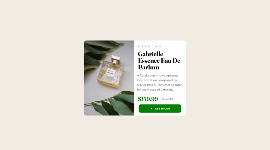
I'll first answer your question about why the two div containers are not the same size: Both divs are within the main container (meaning the main container is the parent), and the main container does not have a width set (aside from its default 100%). Because of that, it takes the width of the parent, which is the body, and which also is at 100%. Your image container has a height set, and the width would be based on that height since it's all proportional; your product info container's width is determined by its contents, which at the moment are stretching across the page in mobile mode. There needs to be an understanding about how boxes work and what determines their sizes; either the content determines the width of a box or the parent of the container.

How I would fix this: Create a new parent div container with a max-width on it. Instead of using the main container (which, as I said, is the parent container now of both divs), I'll have a new container that I call "card". The main container will be used instead as a container for providing padding to ensure the card doesn't hit the sides of the browser. Here's the structure:

<body>
  <main>
    <div class="card">
      <div class="image container"></div>
      <div class="product info"></div>
    </div>
  </main>
</body>

Here are the changes I then made:

  • On body, change display:flex to display:grid, and add place-content: center to center everything
  • On main: add padding: 1rem
  • On card: add max-width: 420px
  • On product-image: add object-fit: cover and width: 100% to help with containing the image within its parent container so that the image's dimensions don't get distorted
  • On product-info: add flex-direction: column and padding: 1.5rem. Remove all the left and right padding in every element, and add a width: 100% on the button. Things should be looking better by now.

For the desktop view, in your media query:

  • On card: add display:flex, max-width:600 and height: 100% to the card container.
  • On image-container, add height: 100%
  • On product-info: Remove height: 400px and also remove the padding-top and padding-bottom in the children that's creating the extra vertical padding

I hope this helps to restore your sanity a bit. Keep practicing to make sure you develop a fundamental understanding of boxes and widths, and I hope to see an improved solution soon. Good luck!

Marked as helpful

1

Daniel Ayala• 290

@dan-ayalahdez

Posted

@elaineleung Very helpful, thanks a lot, Elaine.

1
James• 340

@James-alderson

Posted

  1. You can use two methods for this: flexbox and css grid:
  • In flexbox, you can add flex: 1 1 50%; For both the product info element and the image container, make both elements equal in width (of course, the parent element must have display: flex; ).
  • In the css grid, you can add the grid-template-columns value: repeat(2, 1fr); Do this with the main element.
  1. It can be said that both can be used (of course, depending on the circumstances).
  2. There is no strict rule for this, you can design as you are comfortable, if you are new, my suggestion is to design for desktop first, then for mobile, then with time and progress in design You can design first for mobile and then for desktop.

Don't worry, I also faced such problems when I had just started designing, but I fixed these problems with time.

Now that I looked at your design I noticed that it is slightly different from the one you posted as a solution. No problem, I'll create a fork on your GitHub repository where I'll answer the above questions and help you with ways to improve the design.

Keep learning 💪 and happy coding 🚀.

1
James• 340

@James-alderson

Posted

Hi Daniel Ayala

I have created a pull request in your repository, you can review the changes and add the changes to your design.

0

Please log in to post a comment

Log in with GitHub
Discord logo

Join our Discord community

Join thousands of Frontend Mentor community members taking the challenges, sharing resources, helping each other, and chatting about all things front-end!

Join our Discord