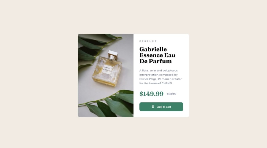
Design comparison
Solution retrospective
Hello everyone,
I just wanted to share my excitement about using Sass for the first time. It's truly awesome and has made my stylesheet development more efficient. However, I encountered a challenge with mixins, specifically when it came to handling media queries.
I was unsure whether to include media query styles directly within each class or import a separate document for mobile styles. After careful consideration, I decided that importing a whole document for mobile styles is a better approach. This way, I can keep the media query styles in one place and import them where needed.
By using this approach, I can ensure modularity and reusability of my code. It also makes it easier to maintain and update the mobile-specific styles without scattering media queries throughout different classes.
I would love to hear your thoughts and experiences regarding this topic. If you have any suggestions or alternative approaches, please feel free to share.
Thank you all!
Community feedback
Please log in to post a comment
Log in with GitHubJoin our Discord community
Join thousands of Frontend Mentor community members taking the challenges, sharing resources, helping each other, and chatting about all things front-end!
Join our Discord
