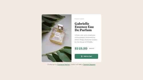
Product card using CSS Grid and fluid spacing

Solution retrospective
This challenge was the first time that I used fluid spacing and everything works fine, I'm also proud of the responsive grid layout without using media queries, I know it is a simple two-column layout but I never made it without media queries.
What challenges did you encounter, and how did you overcome them?I didn't encounter any particular challenge for this project, just a small problem with the image that didn't fill the container properly, I explain that in more detail down below.
What specific areas of your project would you like help with?When I become on the larger device the element fills the container properly while the doesn't, there is a small padding on the bottom, I think because the right side has padding all around.
By myself, I opted to set the eight: 100% on the img.
I would like to know if this solution is fine or if there is a better solution to use.
Thanks a million in advance ✌️
Cheers 😎 Daniele
Please log in to post a comment
Log in with GitHubCommunity feedback
No feedback yet. Be the first to give feedback on Daniele's solution.
Join our Discord community
Join thousands of Frontend Mentor community members taking the challenges, sharing resources, helping each other, and chatting about all things front-end!
Join our Discord