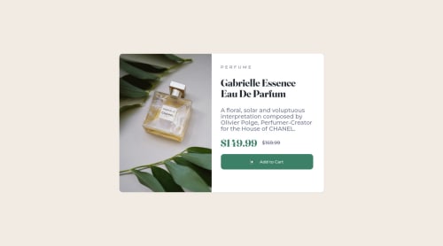
Product card using html and css

Solution retrospective
-
The part of centering the card became a little complex for me, I found a solution but I feel I could have done it more effectively
-
improvement suggestion?
Please log in to post a comment
Log in with GitHubCommunity feedback
- @azhar1038
Hi Wanderson, congratulations in completing the challenge!
To center the card, I see you tried to use flex but then went with transform. You can simply do this:
body {
  display: flex;
  height: 100vh;
  width: 100vw;
  align-items: center;
  justify-content: center;
}
This will bring your card to center.
I also see that your cart icon is not visible. Your
srcshould beimages/icon-cart.svgbut you have used/images/icon-cart.svg. The front/takes to root i.ehttps://devwanderson.github.io/.In the challenge two different product images are provided, one for mobile and other for desktop, you can use
<picture>to specify which image to load on which screen using media query.You should also make your card more responsive by using
min-widthormax-widthinstead of fixed width. You should update your media query too so that you switch to mobile view before it compresses to much. Remember the width provided in style-guide are just for reference related to the picture provided or the width that frontendmentor uses to generate screenshot. So, don't just restrict on using those numbers.Please update your code link too. It gives 404 currently.
Hope it helps :)
Marked as helpful - @avinashdhauni
Hello, I guess you forgot to make your project responsive. Also, there is an issue with your line-height on the paragraph. Image width should take up to 50% of the space. There is slight difference with your design and the given design. Also the font size could be smaller. But congratulations on working and completing the challenge
Marked as helpful


Join our Discord community
Join thousands of Frontend Mentor community members taking the challenges, sharing resources, helping each other, and chatting about all things front-end!
Join our Discord