Skip to content
  • Unlock Pro
  • Log in with GitHub
Solution
Submitted over 1 year ago

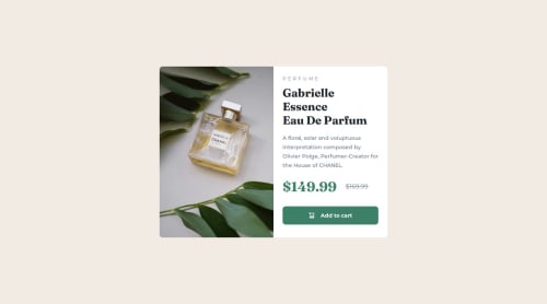
Product card using React & Tailwindcss

react, tailwind-css
Alan Heffernan•215
@alanjheffernan
A solution to the Product preview card component challenge
View live sitePreview (opens in new tab)View codeCode (opens in new tab)

Solution retrospective


Really enjoying using tailwindcss with react. Practice makes perfect.

Code
Select a file

Please log in to post a comment

Log in with GitHub

Community feedback

  • Bishal Singh Deo🎮•1,440
    @Bishalsnghd07
    Posted over 1 year ago

    Hi, @alanjheffernan👋

    You said very well👏 and one more line I wanna add into it "practice makes man Superman" believe it. Practice makes you everything what you want. And in this project your hard work showing of. And always set in your mind that tailwind CSS always use utility first approach and you deliver it and I will give just small recommendation, divide your code into smaller chunks to maintain code structure and code scalability

    I'll just congratulate you to complete this challenge🎉 and want to see amazing projects ahead from you💓

    Happy Coding❤️

    Marked as helpful
  • Abdul Khaliq 🚀•72,360
    @0xabdulkhaliq
    Posted over 1 year ago

    Hello there 👋. Congratulations on successfully completing the challenge! 🎉

    • I have an suggestion regarding your code that I believe will be of great interest to you.

    PiCTURE TAG 📸:

    • Looks like you're currently using custom function named getImageUrl for swapping different version of image.

    const getImageUrl = () => {
        return windowWidth < 768 ? productMobileImage : productDesktopImage;
      };
    

    So let me introduce the picture element. It is commonly used for responsive images, where different image sources are provided for different screen sizes and devices, and for art direction, where different images are used for different contexts or layouts.

    • Example:
    <picture>
      <source media="(max-width: 768px)" srcset="small-image.jpg">
      <source media="(min-width: 769px)" srcset="large-image.jpg">
      <img src="fallback-image.jpg" alt="Example image">
    </picture>
    

    • In this example, the <picture> tag contains three child elements: two <source> elements and an <img> element. The <source> elements specifies different image sources and the conditions under which they should be used.

    • Using this approach allows you to provide different images for different screen sizes without relying on custom functions, and it also helps to improve page load times by reducing the size of the images that are served to the user

    • If you have any questions or need further clarification, you can always check out my submission and/or feel free to reach out to me.

    .

    I hope you find this helpful 😄 Above all, the solution you submitted is great !

    Happy coding!

Join our Discord community

Join thousands of Frontend Mentor community members taking the challenges, sharing resources, helping each other, and chatting about all things front-end!

Join our Discord
Frontend Mentor logo

Stay up to datewith new challenges, featured solutions, selected articles, and our latest news

Frontend Mentor

  • Unlock Pro
  • Contact us
  • FAQs
  • Become a partner

Explore

  • Learning paths
  • Challenges
  • Solutions
  • Articles

Community

  • Discord
  • Guidelines

For companies

  • Hire developers
  • Train developers
© Frontend Mentor 2019 - 2025
  • Terms
  • Cookie Policy
  • Privacy Policy
  • License

Oops! 😬

You need to be logged in before you can do that.

Log in with GitHub

Oops! 😬

You need to be logged in before you can do that.

Log in with GitHub

How does the accessibility report work?

When a solution is submitted, we use axe-core to run an automated audit of your code.

This picks out common accessibility issues like not using semantic HTML and not having proper heading hierarchies, among others.

This automated audit is fairly surface level, so we encourage to you review the project and code in more detail with accessibility best practices in mind.

How does the CSS report work?

When a solution is submitted, we use stylelint to run an automated check on the CSS code.

We've added some of our own linting rules based on recommended best practices. These rules are prefixed with frontend-mentor/ which you'll see at the top of each issue in the report.

The report will audit 1st-party linked stylesheets, and styles within <style> tags.

How does the HTML validation report work?

When a solution is submitted, we use html-validate to run an automated check on the HTML code.

The report picks out common HTML issues such as not using headings within section elements and incorrect nesting of elements, among others.

Note that the report can pick up “invalid” attributes, which some frameworks automatically add to the HTML. These attributes are crucial for how the frameworks function, although they’re technically not valid HTML. As such, some projects can show up with many HTML validation errors, which are benign and are a necessary part of the framework.

Oops! 😬

You need to be logged in before you can do that.

Log in with GitHub

Oops! 😬

You need to be logged in before you can do that.

Log in with GitHub