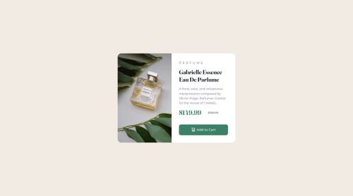
Product Design CSS

Solution retrospective
Hello, mentors!
please, I would really appreciate an honest review of my project.
Help a newbie grow.
Thank you.
Please log in to post a comment
Log in with GitHubCommunity feedback
- @correlucas
👾 Hello Tobby, congratulations for your new solution!
I'll give you my sincere review as you asked:
1.Sice you've used
gridinside the container, there's no need to set the column sizes as you've usedflex and widthfor each column. You'll need flex only for the column with the product info.Set the container columns with
grid-template-column; 1fr 1fr;for a grid with two equal columns..container { display: grid; place-content: center; min-height: 100vh; grid-template-columns: 1fr 1fr; }Fixing that the rest is really good done, my tip is to fix only one thing in the mobile version, the product image should be a little bit smaller, so you can use a value for the
min-heightaround 25vh or set a new media query. Code below:.image { max-width: 100%; min-height: 35vh; background-image: url(./product-preview-card-component-main/images/image-product- }Hope it helps, happy coding!
Marked as helpful

Join our Discord community
Join thousands of Frontend Mentor community members taking the challenges, sharing resources, helping each other, and chatting about all things front-end!
Join our Discord