Product page using flex in css

Solution retrospective
How do I get the main div in the middle of this whole page? It is located in the middle of the top line, but I want to locate it in the middle of the page. let me know how to do it
Please log in to post a comment
Log in with GitHubCommunity feedback
- @andreasremdt
Hey @sujeong054,
Nice job on finishing this challenge! It looks really good and you made good use of Flexbox. To answer your question:
body {
  display: grid;
  place-items: center;
  min-height: 100vh;
}
With these three CSS properties, you can center everything within your body to the center.
min-height: 100vhis important because it makes thebodyas big as your browser viewport. Without that line, thebodyalways takes up only the space of its children, so you won't get the effect.With the above, you can reduce your CSS on the
.mainelement:.main { display: flex; background-color: var(--White); border-radius: 15px; height: 650px; }Besides that, a couple of additional suggestions:
- Try to use more semantic HTML elements. As the accessibility report already indicates, your page should have at least one main landmark, meaning that you should wrap your application in a
mainelement. You can replace thediv.mainwith amain.mainto make that work. - The page is also missing a title. You've used a lot of
divandspanelements for the text content, which don't convey any semantic meaning. Screen readers and search engines will have trouble understanding what's the product title, its category, or description. I'd recommend the following HTML structure:
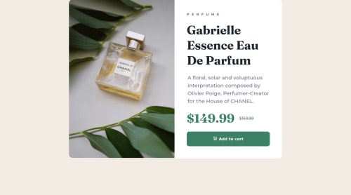
<p>Perfume</p> <h1>Gabrielle Essence Eau De Parfum </h1> <p>A floral, solar and voluptuous interpretation composed by Olivier Polge, Perfumer-Creator for the House of CHANEL.</p> <div> <p><span class="sr-only">Current price:</span>$149.99</p> <p><span class="sr-only">Old price:</span>$169.99</p> </div> <button type="button">Add to Card</button>- With the above code, you get an
h1as the page title and apfor the description. From a perspective of accessibility, the pricing section a bit challenging - while we can visually indicate that the price is reduced, we have to explain it to those who can't see. I includedspanelements for that, made invisible via the.sr-onlyclass. If you want to learn more about this technique, here's a great explanation. - All interactive elements like buttons or links should have some hover and focus styles. Your button lacks these, making it unclear whether it's clickable or not. You could change the background color on hover to be darker or brighter, just as an idea.
Hope this answers your question and gives you some help. Let me know if you have any questions :-)
Marked as helpful - Try to use more semantic HTML elements. As the accessibility report already indicates, your page should have at least one main landmark, meaning that you should wrap your application in a

Join our Discord community
Join thousands of Frontend Mentor community members taking the challenges, sharing resources, helping each other, and chatting about all things front-end!
Join our Discord