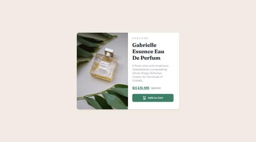
Product Preview Card - React & Tailwind CSS

Solution retrospective
I'm proud of the design and how close it resembles the original.
I would employ a system to make it easier to transform the 'large screen' version to a 'small screen' version. This process took me quite a bit.
What challenges did you encounter, and how did you overcome them?I had a challenging time reformatting the large screen design to small screen. I'm going to search out a system or method to make this easier.
What specific areas of your project would you like help with?Ways or tips to simplify the design process for both small and large screens.
Please log in to post a comment
Log in with GitHubCommunity feedback
- @dylan-dot-c
Oh hello there... heard you wanted a better process of turning larger screen designs into smaller one, well... I dont know if this count, but I always(since recently) go for mobile-first solutions(mobile-first desktop-last), they prove to be more efficient from what I have been through so far and I actually like it.
- @Alex-Archer-I
Hi!
I can get you a hint about
imgtag. There is apicturetag which dynamically switch images according to media conditions.<picture> <source srcset="mobile.jpg" media="(max-width: 900px)"> <img src="desktop.jpg" alt=""> </picture>There could be different
sourcetags with various conditions. If no one of them matches thanimgwould be rendered.Also I'm not sure about
afor the button. This project is out from context, but there are two possible situations here - the cart managed on the client side and then data sent to the server after the purchase, or all data about cart changing sent to server immediately. In the both cases there should be button tag (in the second case it would betype=submitbutton inside the form).Hope that helps =)


Join our Discord community
Join thousands of Frontend Mentor community members taking the challenges, sharing resources, helping each other, and chatting about all things front-end!
Join our Discord