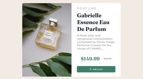
Product Preview Card

Solution retrospective
Most proud that this project did not take me as long as the other projects. Using the mobile first method has changed the way I code, mostly because it is much simpler for me to expand the layout to fit bigger screens, instead of having to shrink everything to force fit on a mobile screen.
What challenges did you encounter, and how did you overcome them?Only challenge I faced on this project was having the browser switch from one image to the other depending on the screen size. The way I overcame this challenge was by setting both images in my HTML code and hiding one or the other depending in the screen size. I achieved this by using simple media query for screen sizes above 1024px i set the smaller image to display of none and the opposite for mobile size screens.
Please log in to post a comment
Log in with GitHubCommunity feedback
No feedback yet. Be the first to give feedback on Juan's solution.
Join our Discord community
Join thousands of Frontend Mentor community members taking the challenges, sharing resources, helping each other, and chatting about all things front-end!
Join our Discord