


@correlucas
Posted
👾Hello Petri, congratulations for your solution!
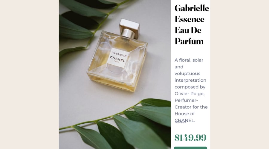
I saw that you're having some struggles with this challenge. I've some suggestions to you rebuild the challenge using grid to manage the two columns all you need to do is create a main block to hold all the content (you can use <main> to wrap), set its width as max-width: 1000px (it's the container size) and display: grid / grid-template-column: 1fr 1fr(this means that your component will have two columns with 50% of the container width each thats 500px). Then you can use display: flex to manage the content and gap to create the spacing for the text content.
To make the product image responsive use display: block and max-width: 100% (to take the column size) and object-fit: cover to make the image crop inside the column while the screen scales down. This makes the image super responsive.
👋 I hope this helps you and happy coding!
Marked as helpful
@Peteksi95
Posted
@correlucas Thank you very much. Yes this challenge gave me a bit of a hard time,, so ill take on your suggestion try to rebuild using grid

