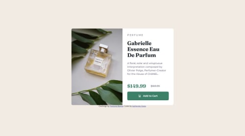
Submitted over 1 year agoA solution to the Product preview card component challenge
Product Preview Card Challenge

@cdGuilherme
Solution retrospective
What are you most proud of, and what would you do differently next time?
I learned how to adapt to different screen sizes using CSS Flexbox. I achieved this by separating the image from the rest of the card content inside a flexbox and changing the flex-direction property depending on the screen size.
What challenges did you encounter, and how did you overcome them?- "Flexbox item widths are affected by padding" on stackoverflow and "CSS flex Property" by w3schools - This helped me when evenly distributing the items inside the flexbox for desktop viewing because of the added padding by the content.
- "Changing Image depending on Mobile or Desktop HTML & CSS" on stackoverflow - This helped me when changing the perfume image depending on screen size.
Nothing specific. However I'm open to feedbacks about code quality or anything I can improve. If you find anything please let me know! 🙏
Code
Loading...
Please log in to post a comment
Log in with GitHubCommunity feedback
No feedback yet. Be the first to give feedback on Guilherme Costa's solution.
Join our Discord community
Join thousands of Frontend Mentor community members taking the challenges, sharing resources, helping each other, and chatting about all things front-end!
Join our Discord