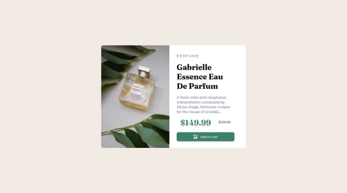
Product preview card component

Solution retrospective
I always find the media query(making responsive) part difficult.
Please log in to post a comment
Log in with GitHubCommunity feedback
- @PadseFIAE
Hello Natnael,
your solution for the desktop looks fine to me.
A problem with the responsive design is the fixed sizes of Elements. Try to use % attributes, this should help u for the resize on any screens. But u allready get a Link from Deevyn9, i think that will explain it a little bit deeper.
The different between % and vh is that vh take care of the Viewport and the % of the parent Element (i learnd yesterday).
Hope my tip will help u in future :-)
Marked as helpful - @Deevyn9
Hi Natnael, congrats on completing this project, your solution looks really great.
About the issue you say you have with media queries, have a look at this documentation, It should make you understand media queries more. Good luck.
https://developer.mozilla.org/en-US/docs/Web/CSS/Media_Queries/Using_media_queries
Happy Coding!
Marked as helpful


Join our Discord community
Join thousands of Frontend Mentor community members taking the challenges, sharing resources, helping each other, and chatting about all things front-end!
Join our Discord