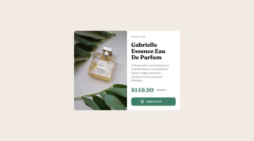
Product preview card component

Solution retrospective
Thanks for checking this out any input is much appreciated!
Please log in to post a comment
Log in with GitHubCommunity feedback
- @Blackpachamame
Greetings Chris! your solution looks very good 😃
May I suggest that, to make your image fit the container and not stretch to fill the space, you use a
background-size: coverinstead ofbackground-size: 100% 100%Marked as helpful - P@danielmrz-dev
Hello @chintriago!
Your solution looks excellent!
I have just one suggestion:
- You could've used only the tag
maininstead ofmainandarticle.
The tag
articlewould make more sense if the card was part of a bigger website (it certainly would in real world). But here, the card is all we have on the screen, so it's the main content.I hope it helps!
Other than that, great job!
Marked as helpful - You could've used only the tag
- @AhlamAb22
You can use <s> for the old price and also it's better to add some visually hidden text for the old price and the current price for screenreaders users
Marked as helpful


Join our Discord community
Join thousands of Frontend Mentor community members taking the challenges, sharing resources, helping each other, and chatting about all things front-end!
Join our Discord