


hitmorecode• 6,270
@hitmorecode
Posted
Really nice job it looks great. Still I have a few suggestions on how you can improve.
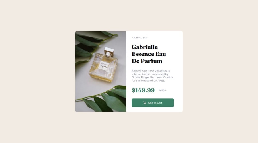
- When working with images (in this case two different images for two different screen sizes) it's best to make use of the picture element.
Picture element here you can get information on how the picture element works and how you can use it. The HTML picture element explained this is a good video tutorial on this subject.
I see you are using CSS rest which is a good thing, but you need to add these two lines to it.
padding: 0;
box-sizing: border-box;
This I wouldn't add it to .main-container I would add it to the body
      .main-container {
        height: 100vh;
        background-color: hsl(30, 38%, 92%);
        display: flex;
        justify-content: center;
        align-items: center;
      }

      body {
        min-height: 100vh; // it's good practice to use min-height: 100vh on the body
        background-color: hsl(30, 38%, 92%);
        display: flex;
        justify-content: center;
        align-items: center;
        // you can add this to the body as a font-family fallback
        font-family: arial, helvetica, sans-serif;
      }
You could have combined .title-styles and .discount into one CSS rule. Both of them use the same font-family
.title-styles,
.discount {
    font-family: Fraunces;
}
As for your media-query change the max-width to 600px. This will prevent the right side of the card to overflow to the left side.
Keep it up
Marked as helpful
1


