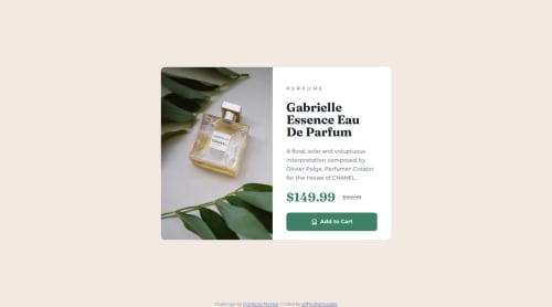
Product preview card component

Solution retrospective
I’m most proud of the solution’s clean and well-organized structure, which closely matches the design provided. The use of semantic HTML elements such as <article>, <picture>, and <main> enhances the accessibility and readability of the markup. The layout is responsive and adapts effectively across mobile and desktop screen sizes, maintaining a polished and consistent appearance. CSS design tokens, such as variables for colors and typography, improve maintainability and scalability, which is a strong aspect of the implementation.
Next time, I would focus on improving accessibility by adding meaningful alt text to the product image to provide context for screen readers. Additionally, the button’s interactivity could be enhanced with focus and hover states to make it more dynamic and engaging for users. Refining the layout for tablet breakpoints, which are not explicitly addressed, would further strengthen the solution’s responsiveness and inclusivity.
What challenges did you encounter, and how did you overcome them?ne challenge was achieving the correct spacing and alignment for the text content while keeping it visually balanced within the card. This was resolved by using CSS flexbox with properties like justify-content: space-around, ensuring even distribution of elements. Another challenge was maintaining consistency between mobile and desktop layouts, particularly for the image scaling and content alignment. This was successfully handled by using the <picture> element with media queries to provide the appropriate image size and aspect ratio for different devices. The overall approach demonstrates a solid grasp of responsive design principles and attention to detail.
What specific areas of your project would you like help with?I’d appreciate feedback on a few specific areas of the project. First, I’d like help refining accessibility, particularly ensuring that the product image and button have sufficient support for screen readers and keyboard navigation. Suggestions for improving interactivity, such as more engaging hover and focus states, would also be valuable.
Additionally, I’d welcome advice on how to optimize the CSS structure further, especially for the responsive design. While the desktop and mobile layouts work well, I’d like input on how to handle intermediate tablet breakpoints more effectively. Lastly, if there are opportunities to simplify or enhance the use of CSS variables to make the design system even more modular and reusable, I’d love to explore those improvements.
Please log in to post a comment
Log in with GitHubCommunity feedback
No feedback yet. Be the first to give feedback on jeffgrahamcodes's solution.
Join our Discord community
Join thousands of Frontend Mentor community members taking the challenges, sharing resources, helping each other, and chatting about all things front-end!
Join our Discord