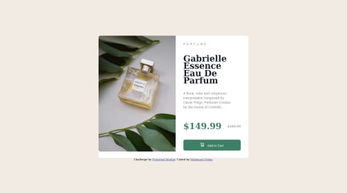
product preview card using flexbox and CSS grid layout

Please log in to post a comment
Log in with GitHubCommunity feedback
- @MelvinAguilar
Hello there 👋. Good job on completing the challenge !
I have some feedback for you if you want to improve your code.
HTML 📄:
- Use the
<main>tag to wrap all the main content of the page instead of the<div>tag. With this semantic element you can improve the accessibility of your page.
- The <div> tag defines a division or section on a website. It is used to style a container with CSS, set special alignment, or position content. It might be more efficient to use the <p> tag; the <p> element represents paragraph-level content, usually text:
<p>A floral, solar and voluptuous interpretation composed by Olivier Polge, Perfumer-Creator for the House of CHANEL.</p>- The
<h1>is the most important heading on the page, In this challenge the perfumer's name can be considered like the title of the page, so it should be the<h1>
-
You could use the
<del>tag to indicate the price that was before the discount. Additionally, you can use asr-onlyclass to describe the discount. This will help screen reader users to understand that the price was discounted.Example:
<del><span class="sr-only">Old price: </span>$169.99</del>
- The
altattribute should not contain underscores or hyphens, it must be human readable and understandable.
-
The cart-icon is a decorative image, it does not add any information to the page. You should use an empty
altattribute. You can read more about this here 📘.If you want to learn more about the
altattribute, you can read this article. 📘.
-
You can use the
<picture>tag when you have different versions of the same image 🖼. Using the<picture>tag will help you to load the correct image for the user's device. You can read more about this here 📘.Example:
<picture>
    <source media="(max-width: 460px)" srcset="./images/image-product-mobile.jpg">
    <img src="./images/image-product-desktop.jpg" alt="{your alt text goes here}">
</picture>
CSS 🎨:
- Avoid using uppercase text in your HTML because screen readers will read it letter by letter. You can use the
text-transformproperty to transform the text to uppercase in CSS.
I hope you find it useful! 😄 Above all, the solution you submitted is great!
Happy coding!
Marked as helpful - Use the
- @AbdulrhmanSoliman
Hello, @mselim7 congratulation on completing this challenge.
Here are some feedbacks to improve your code.
First
You should link you CSS file within the HTML
Headtag. learn more hereSecond
To make the design centralized vertically and horizontally or to make it in the middle of the screen you should apply these Syltes below in the HTML
bodytagmargin: 0; display: flex; height: 100vh; flex-direction: column; justify-content: center; align-items: center;Finally
Keep going my friend and practice more. I remember that when I started coding I'm getting some similar issues.
Marked as helpful - @Hassiai
Replace<div class="bigContainer">with the main tag, <div class="preview"> with <p>, <div class="heading"> with <h1>, <div class="info"> with <p> and <div class="attribution"> with the footer tag to fix the accessibility issues. Add the alt attribute
alt=" "to the img to fix the error issue. click here for more on web-accessibility and semantic htmlThe link tag<link> should be within the head tag <head> of the html file.
To center .bigcontainer on the page, add min-height:100vh; display: flex; align-items: center: justify-content: center; or min-height:100vh; display: grid place-items: center to the body.
To center .bigcontainer on the page using flexbox:
body{
min-height: 100vh;
display: flex;
align-items: center;
justify-content: center;
}
To center .bigcontainer on the page using grid: body{ min-height: 100vh; display: grid; place-items: center; }Use relative units like rem or em as unit for the padding, margin, width values and preferably rem for the font-size values, instead of using px which is an absolute unit. For more on CSS units Click here
Hope am helpful.
Well done for completing this challenge. HAPPY CODING
Marked as helpful


Join our Discord community
Join thousands of Frontend Mentor community members taking the challenges, sharing resources, helping each other, and chatting about all things front-end!
Join our Discord