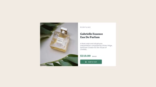
Submitted almost 3 years agoA solution to the Product preview card component challenge
Product Preview Card using CSS media query

@AnalystKAL
Solution retrospective
- This was my first time using media query in CSS to switch between layouts and images. When should I use min-width or max-width in these media queries?
- In mobile version, the image's div container has a longer height than the image's height. I tried object-fit but still the image did not fill the div container. So I'm unsure what I did wrong in my css or in that particular div container.
- What are the best ways to separate sections in one div? CSS grid or Flexbox? Are there situations for each?
Code
Loading...
Please log in to post a comment
Log in with GitHubCommunity feedback
No feedback yet. Be the first to give feedback on Kal's solution.
Join our Discord community
Join thousands of Frontend Mentor community members taking the challenges, sharing resources, helping each other, and chatting about all things front-end!
Join our Discord