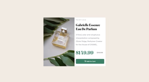
Product preview card component

Solution retrospective
Hey there! First challenge with Frontend Mentor,
Do you folks have any suggestions of best practices? I feel that regarding the text style I wasn't super clear with my CSS.
Feddback welcome.
Thank you :)
Please log in to post a comment
Log in with GitHubCommunity feedback
- @DavidMorgade
Hello Margarida, welcome to the community and congrats on completing your first FrontEndMentor challenge!
If you don't mind I would like to give you a little advice for this challenge.
I saw in your code that you commented out the image in your html, and added it on your CSS files, instead of using it as a background image, you can use the
<picture></picture>tags with two<source>tags (instead ofimgtags), and use both images, the desktop and the mobile version, and render them conditionally depending on the size of the screen. This method is perfect for this challenge!You can learn how to use the
<picture>tag here.Hope my feedback helps you!, if you have any question, don't hesitate to ask.
Marked as helpful - @freakyjones
Hi Margarida,
congratulation on completing this challenge. I just saw your code and would like to give some suggestions with your permission
-
your border radius is not showing up in desktop view probably because your parent container card is much bigger than your child div card image. Try to give your parent a fixed height and then make your card-image container height 100% of the parent's height. in addition you can give your background image `{background-position:center, background-size:cover}.
-
More space between the card text container and its content will greatly improve your UI.
personally, i like to add
{margin:0,padding:0}with*{box-sizing:border-box}for getting rid of default browser styles.hope it helps, Thanks, happy coding :)
-


Join our Discord community
Join thousands of Frontend Mentor community members taking the challenges, sharing resources, helping each other, and chatting about all things front-end!
Join our Discord