@tesla-ambassador
Posted
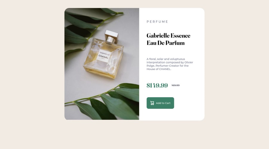
Hey 12Nuskek, congratulations on completing this challenge! I hope you had lots of fun doing this! Here's a few tips and a few answers to your questions:
- Getting around image sizes can be cumbersome sometimes but incase you don't want to do it all the time, place the image in a container and then set its
widthandheightproperties to 100% so that it occupies that container and then you can set the size of the container to a percentage relative to it's parent element saywidth: 90%and the image will always resize according to the change in the size of its container. - Your CSS code gets cleaner with time so long as you keep on practicing, I looked at your code and it was quite messy but It's still very readable so that is good! You can just look at how some other people write their css and you'll be able to borrow a leaf or two.
- It's okay to use your padding and margin values in
pxas a matter of fact most people usepxto set their margin and padding properties. Also yes, it's always advisable to add margins and paddings where necessary. - You need to add an
alttext to your images. This is because it tells the browser what image is being displayed and this can also help those using screen readers to know what image is being displayed on the website. It will also clear some of your HTML validation issues and accessibility issues - In order to resolve some of your accessibility issues, you might wanna use landmarks in your html code, these help browsers easily navigate your code. So you might consider wrapping your divs in landmarks like
<main>or<header>or<footer>you need to do this according to how your page is structured. Incase you want to know more about landmarks, follow this link.
Happy coding and keep up the good work! 👍
Marked as helpful
@12nuskek
Posted
@tesla-ambassador Thank you so much for the feedback! This is really helpful cheers!

