Not Found
Not Found
Not Found
Not Found
Not Found
Not Found
Not Found
Not Found
Not Found
Not Found
Not Found
Not Found
Not Found
Not Found
Not Found
Not Found
Not Found
Not Found
Not Found
Not Found

Submitted

Product preview card component Fronted Mentor

Dominika 80

@explorem

Desktop design screenshot for the Product preview card component coding challenge

This is a solution for...

  • HTML
  • CSS
1newbie
View challenge

Design comparison


SolutionDesign

Solution retrospective


I got stuck for a long time with svg styling. I haven't learned about svg yet. I had a problem with setting the SVG to the text in the button. SVG and text also had to be responsive to screen size. At the current level of knowledge, I used the display: inline-block property to align the SVG with the text. To do this, I enclosed the text with a span tag. I was able to position the SVG on the left side away from the text. Using the vertical-aligne property, I positioned the text in the center of the SCG.This was the most difficult for me in this exercise.

Community feedback

Lucas 👾 104,560

@correlucas

Posted

👾Hello @explorem, Congratulations on completing this challenge!

Your solution its almost done and I’ve some tips to help you to improve it:

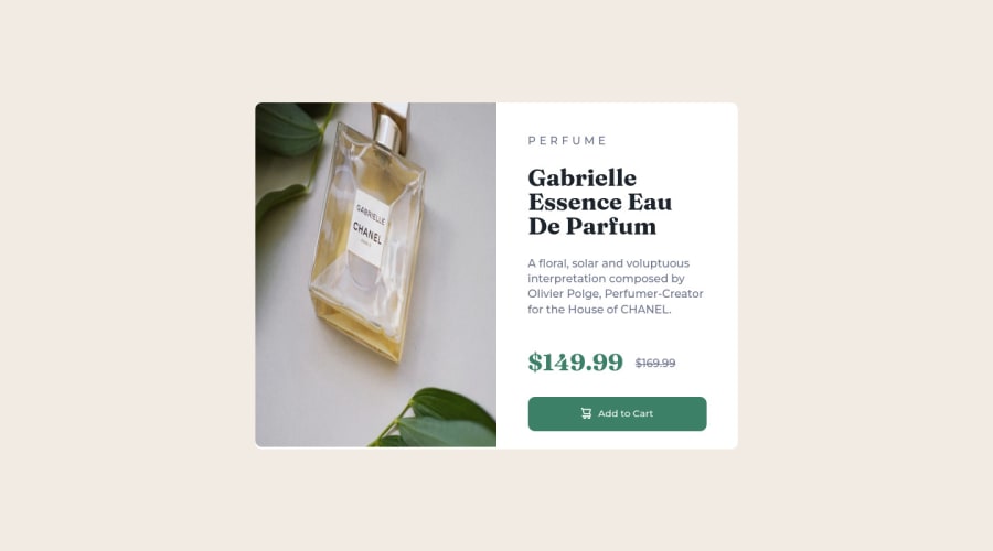
Use the THE PICTURE TAG that is a shortcut to deal with the multiple images in this challenge. So you can use the <picture> tag instead of importing this as an <img> or using a div with background-image. Use it to place the images and make the change between mobile and desktop, instead of using a div or img and set the change in the css with display: none with the tag picture is more practical and easy. Note that for SEO / search engine reasons isn’t a better practice import this product image with CSS since this will make it harder to the image. Manage both images inside the <picture> tag and use the html to code to set when the images should change setting the device max-width depending of the device desktop + mobile.

Check the link for the official documentation for <picture> in W3 SCHOOLS: https://www.w3schools.com/tags/tag_picture.asp

See the example below:

<picture>
  <source media="(max-width:650px)" srcset="./images/image-product-mobile.jpg">
  <img src="./images/image-product-desktop.jpg" alt="Gabrielle Parfum" style="width:auto;">
</picture>

👨‍💻Here's my solution for this challenge if you wants to see how I build it: https://www.frontendmentor.io/solutions/product-preview-card-vanilla-css-and-custom-hover-state-on-hero-85A1JsueD1

✌️ I hope this helps you and happy coding!

Marked as helpful

1

Dominika 80

@explorem

Posted

@correlucas Thank you one more time. I will use <picture> tag instead of <img> tag. It was very helpful.

:)

0

@VCarames

Posted

Hey @explorem, regarding your issue...

The following will make things easier.

HTML:

<button>
          <img src="images/icon-cart.svg" alt="" aria-hidden="true"> Add to
          Cart
        </button>

CSS:

button {
    display: flex;
    justify-content: center;
    align-items: center;
    gap: 10px;
    text-align: center;
}

adding to what was said above/below:

  • To give you HTML code structure, you want to set up your code in the following manner (only did parent containers):

HTML

   <body>
      <main>
        <article class=“card-container”>
          <picture></picture>
          <div class="card-content">
          </div>
        </article>
      </main>
    </body>

The Main Element identifies the main content of the document.

While the Article Element will serve as the card’s container, because the card represents a complete, or self-contained, section of content that is, in principle, independently reusable.

More info:

https://web.dev/learn/html/headings-and-sections/

  • The Alt Tag Description for the image needs to be improved upon. You want to describe what the image is; they need to be readable. Assume you’re describing the image to someone.

  • The old price is not being announced properly to screen readers. You want to wrap it in a Del Element and include a sr-only text explaining that this is the old price.

Happy Coding! 👻🎃

Marked as helpful

0

Dominika 80

@explorem

Posted

Hi @vcarames, thank you for reply.

I will change HTML code structure and I see what I can do with svg.

:)

0
Dan 220

@DanRHatfield

Posted

Visually, it looks great. A little big when full screen, but spot on visually.

The switch over to the condensed version happened really early when I was previewing it. Seemed like there was still a lot of space that the browser could have been shrunk before needing making the switch but that might just be my preference.

On Add to Cart, I believe the shopping cart svg image was provided. Here is what I used:

<img src="./images/icon-cart.svg" alt="Cart image">

Marked as helpful

0

Dominika 80

@explorem

Posted

@DanRHatfield

Thank you. I think you are right. I will change the desktop view. I used the moment of change at 1440 px, as it was in the description of the challenge.

:)

0

Please log in to post a comment

Log in with GitHub
Discord logo

Join our Discord community

Join thousands of Frontend Mentor community members taking the challenges, sharing resources, helping each other, and chatting about all things front-end!

Join our Discord