Not Found
Not Found
Not Found
Not Found
Not Found
Not Found
Not Found
Not Found
Not Found
Not Found
Not Found
Not Found
Not Found
Not Found
Not Found
Not Found
Not Found
Not Found
Not Found
Not Found

Submitted

Product preview card component using HTML and CSS

Manish Kumarβ€’ 40

@kumarmash

Desktop design screenshot for the Product preview card component coding challenge

This is a solution for...

  • HTML
  • CSS
1newbie
View challenge

Design comparison


SolutionDesign

Solution retrospective


While working on this project I found that there is small space below the product image in desktop mode. I tried removing it but couldn't do it. Please guide me how I can remove that space or use my image to cover all the section of its container.

Community feedback

@VCarames

Posted

Hey there! πŸ‘‹ Here are some suggestions to help improve your code:

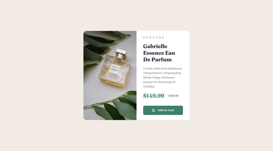
  • Since the images in this component add value and serve a purpose (displaying the product) it needs to be accessible ⚠️. The image needs to be applied using the picture element and not the background-image property, as it will not only let you use different images during different breakpoints it will let apply an alt tag description to image stating what the image is.

Here is how it looks like implemented: EXAMPLE

Syntax:

  <picture>
    <source media="(min-width: )" srcset="">
    <img src="" alt="">
  </picture>

More Info:πŸ“š

https://www.w3schools.com/html/html_images_picture.asp

  • Do not uppercase ❌ "perfume" in HTML as it is not accessible friendly. Instead you will want to style it in CSS.
  • The only heading ⚠️ in this component, is the name of the perfume; β€œGabrielle Essence Eau De Parfum” . The rest of the text should be wrapped in a paragraph element.
  • Currently, the old price (169.99) 🏷 is not being properly announced 😒 to screen readers. To fix this, you are going to wrap the the price in a del element and inside it you will add a span element with an visually-hidden class that will state something like β€œThe previous price was…” and use CSS to make it only visible to screen readers.

More Info:πŸ“š

Del Element

If you have any questions or need further clarification, feel free to reach out to me.

Happy Coding! πŸŽ†πŸŽŠπŸͺ…

Marked as helpful

0

Manish Kumarβ€’ 40

@kumarmash

Posted

@vcarames Thank you so much. I will work upon your suggestion and let you know if any help needed. :)

0
Sivaβ€’ 210

@sivakumars

Posted

Hi Manish,

The small gap at the bottom of the image is due to the default value of display property of the image. By default display: inline is applied for any image, and all inline-elements have line-height, so that small space appears below the image.

The fix for this would be to declare display:block on the image or any selector that targets it. Let me know if this cleared your doubts on that issue.

Marked as helpful

0

Manish Kumarβ€’ 40

@kumarmash

Posted

@sivakumars Thanks Siva. I tried changing display: inline , but what its doing is simply centering the image. That small gap still siting there at the top and bottom now. Below is code snipet:

.product-image {
  display: block;
  max-width: 25rem;
  border-radius: 1.2rem 0 0 1.2rem;
}
0
Sivaβ€’ 210

@sivakumars

Posted

@kumarmash Did you use display:block for .product-image class inside and outside the media-query too?

Also, try using height:100% on the image if the image container is a flex-item

0
Manish Kumarβ€’ 40

@kumarmash

Posted

@sivakumars with height :100% the result is same.

Its only problem with image of desktop screen , mobile screen is fine. For changing images of desktop and mobilescreen I havn't used media query. I just used it for resizing the main container.

0
Sivaβ€’ 210

@sivakumars

Posted

@kumarmash ok! Could you please share the line number in your styles.css file where you made those changes?

It would be easier to see if you push those changes to your codebase, because I am able to fix that issue with some changes using the dev tools.

0
Manish Kumarβ€’ 40

@kumarmash

Posted

@sivakumars I fixed the issue by adjusting some padding and margins. Thanks for your help and support

0
Alaminβ€’ 1,960

@CodePapa360

Posted

Hi Manish KumarπŸ‘‹ Great job on completing this challenge! πŸ₯³

You can also try to set the image as a background-image of the container and set the background-size to cover

#container {
    background-image: url('path/to/image.jpg');
    background-size: cover;
    background-position: center;
    background-repeat: no-repeat;
}

It will make the image to fill the entire container. Please note that the solution may vary depending on the specific HTML and CSS of your project.

Overall, this is a very well done solution to the challenge. Great job!

Hope I'm Helpful! πŸ‘

Keep up the good work! 😊❀️

Marked as helpful

0

Manish Kumarβ€’ 40

@kumarmash

Posted

@CodePapa360 Thanks mate. I tried your ways and leaned new way to change the image when screen sizes changes.

0

Please log in to post a comment

Log in with GitHub
Discord logo

Join our Discord community

Join thousands of Frontend Mentor community members taking the challenges, sharing resources, helping each other, and chatting about all things front-end!

Join our Discord