Not Found
Not Found
Not Found
Not Found
Not Found
Not Found
Not Found
Not Found
Not Found
Not Found
Not Found
Not Found
Not Found
Not Found
Not Found
Not Found
Not Found
Not Found
Not Found
Not Found

Submitted

Product preview card component - HTML, CSS

Alberto Mtz• 20

@Eltunas170

Desktop design screenshot for the Product preview card component coding challenge

This is a solution for...

  • HTML
  • CSS
1newbie
View challenge

Design comparison


SolutionDesign

Solution retrospective


1.- Do you think it is necessary to be practicing tools like Tailwind/Botstrap or continue using only css for the following challenges?

2.- What html tags would you say are necessary for good SEO practices?

3.- Is the MediaQuery better to put in its own css page?

Thank you for all the feedback and comments you can give me. :D

Community feedback

Elaine• 11,420

@elaineleung

Posted

Hi Alberto, welcome to Frontend Mentor, and great job in completing this very first challenge!

About the questions you asked:

  1. I think frameworks can be useful, and there's a reason why they're created. As @Souicia said, I do think it's necessary to be fairly proficient in CSS first before using a framework, otherwise you'd have a hard time troubleshooting when things don't go the way you expected. Once you feel more comfortable and confident in building layouts, you can go and try a framework to see how it can help you.

  2. For SEO, I'd say that the important tags are probably title, meta, headings tags (especially h1), and also probably alt tags. I've seen some articles online about this, and so do have a look around if this is something that you'd be interested to know more about.

  3. I prefer having the media queries with the rest of the stylesheet if I'm already having everything there. There will be times where I might have them on a separate sheet, but generally I like having the media queries easily comparable with the main code.

And now for some feedback on your work!

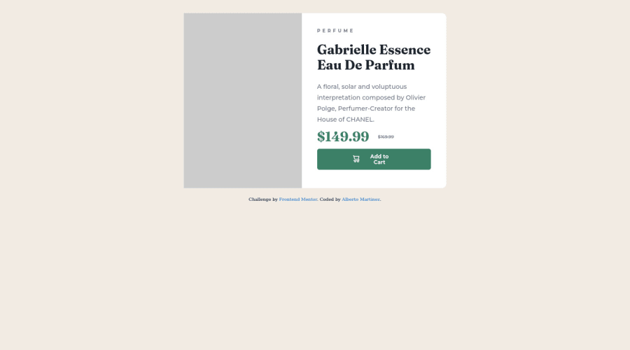
  • About the media query breakpoint, I think min-width: 1440px is much too big. Given that the card's width is about 600px, I'd probably set the layout breakpoint to be around the 600 to 700 range. I think you can try something like 650px to start!
  • I suggest using a responsive image with the picture element instead of using background image, which is really more for images used as a background. In this case, the image is really central to the content, and so you'd want the alt tags available for the image description (which is something you can't do if it's just a background image).
  • To have the image width more even with the text in the desktop view, try adding flex: 1 0 50% on .productCard--img.

That's all for quick feedback; I really think you did a lot things well here, and this is a great start, so keep going!

Marked as helpful

2
Leo• 440

@Souicia

Posted

Hello Alberto,

Congratulation on finishing your first design, it looks quiet neat and responsive.

  1. It entirely depends on your CSS skills. Before exploring CSS frameworks (Tailwind/Bootstrap) you need to have solid CSS skills. This will help you understand those frameworks much better and faster. If you have solid CSS skills (completing junior CSS challenge would be a great test), then sure, you can start by completing easier challenge using those frameworks.

  2. The most important tags for SEO are header, nav, main, section, footer, aside, and maybe article. I am sure there are plenty of more tags and tricks to know (which I don't), but those would be a good start. For instance, your second part with the writing on your challenge could be a section instead of a div. Using header tags are also recommended, and you did that with your h1.

  3. Media queries always need to be below and in the same file as the classes you are targeting. Otherwise, they won't apply. They are two ways to write media queries, either a long one with everything you want to change, or one for each section of your website. What you choose to adopt does not really matter, but if you want my grain of salt, I find that for smaller challenges I prefer a long one, and when you have many sections spread through multiple files (for instance: one file for header, one for main, and one for footer), I find many media queries are more readable than one huge one.

Congrats again your first challenge, have a great day! :)

Marked as helpful

2

Please log in to post a comment

Log in with GitHub
Discord logo

Join our Discord community

Join thousands of Frontend Mentor community members taking the challenges, sharing resources, helping each other, and chatting about all things front-end!

Join our Discord