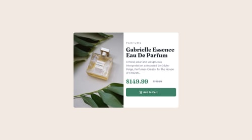
Submitted almost 3 years agoA solution to the Product preview card component challenge
Responsive Product Card Page Using Flexbox and Mobile First Design

P
@aeposten
Solution retrospective
I struggled a bit getting the images to be the correct size and ended up using min and max width and height properties. Is there a better way to go about this?
I'm new to responsive design and would appreciate any suggestions to make my code more dry and semantic.
Code
Loading...
Please log in to post a comment
Log in with GitHubCommunity feedback
No feedback yet. Be the first to give feedback on Amy's solution.
Join our Discord community
Join thousands of Frontend Mentor community members taking the challenges, sharing resources, helping each other, and chatting about all things front-end!
Join our Discord