Skip to content
  • Unlock Pro
  • Log in with GitHub
Solution
Submitted about 1 year ago

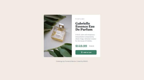
Product Preview Card Component made by ActuallyWIKKO

ActuallyWIKKO•20
@ActuallyWIKKO
A solution to the Product preview card component challenge
View live sitePreview (opens in new tab)View codeCode (opens in new tab)

Solution retrospective


What are you most proud of, and what would you do differently next time?

It took a bit to get the hang of this but it was very satisfying seeing the result, tweaking even the tiny details to make it good to go. It was quite fun.

I would definitely use this document as a future reference on how to set up a card component.

What challenges did you encounter, and how did you overcome them?

First I struggled with alignments and flex box. When I was looking up examples I got the hang of it pretty quickly and wrote my own.

A struggled a little getting the media query set up with the images switching. Turns out I was overthinking it and in the past couple of years it got wayyy easier to do this inline in HTML.

There were a couple of little things too that I had to look up, like transforming the scale of the H2 to make it look more squished or setting the old price to appear centered to the new price (not displaying it on the baseline).

What specific areas of your project would you like help with?

I'd really like to know if I got the sizing right. It looks like it, but I'm not certain. I also would like some advice on using different sizing operators (px vs. rem). I tried to be consistant here but there is some room for improvement.

Code
Select a file

Please log in to post a comment

Log in with GitHub

Community feedback

  • Koda👹•3,830
    @kodan96
    Posted about 1 year ago

    hi there! 👋

    You should avoid hard-coded values (pixels) most of the time. When you use these values you give up responsiveness(or you make it harder for yourself at least)..

    Typically you will increase the font-size property with @media queries. If you have hard-coded values all over your CSS, you need to modify every element's font-size . On the other hand, if you use rem -s all you need to do is changing the font-size in your CSS :root selector and all your elements will have a new size based on that value.

    I usually use em for padding and margin for text-based elements, since their margin usually based on their font-size , and again, when you change the font-size in :root these values will scale up as well without you touching them, making your job easier and your page maintainable.

    If you are not familiar with the :root selector it's usually used to set custom properties(others call them CSS variables ) that you can apply later.

    Hope this was helpful 🙏

    Good luck and happy coding! 💪

    Marked as helpful

Join our Discord community

Join thousands of Frontend Mentor community members taking the challenges, sharing resources, helping each other, and chatting about all things front-end!

Join our Discord
Frontend Mentor logo

Stay up to datewith new challenges, featured solutions, selected articles, and our latest news

Frontend Mentor

  • Unlock Pro
  • Contact us
  • FAQs
  • Become a partner

Explore

  • Learning paths
  • Challenges
  • Solutions
  • Articles

Community

  • Discord
  • Guidelines

For companies

  • Hire developers
  • Train developers
© Frontend Mentor 2019 - 2025
  • Terms
  • Cookie Policy
  • Privacy Policy
  • License

Oops! 😬

You need to be logged in before you can do that.

Log in with GitHub

Oops! 😬

You need to be logged in before you can do that.

Log in with GitHub

How does the accessibility report work?

When a solution is submitted, we use axe-core to run an automated audit of your code.

This picks out common accessibility issues like not using semantic HTML and not having proper heading hierarchies, among others.

This automated audit is fairly surface level, so we encourage to you review the project and code in more detail with accessibility best practices in mind.

How does the CSS report work?

When a solution is submitted, we use stylelint to run an automated check on the CSS code.

We've added some of our own linting rules based on recommended best practices. These rules are prefixed with frontend-mentor/ which you'll see at the top of each issue in the report.

The report will audit all CSS, SCSS and Less files in your repository.

How does the HTML validation report work?

When a solution is submitted, we use html-validate to run an automated check on the HTML code.

The report picks out common HTML issues such as not using headings within section elements and incorrect nesting of elements, among others.

Note that the report can pick up “invalid” attributes, which some frameworks automatically add to the HTML. These attributes are crucial for how the frameworks function, although they’re technically not valid HTML. As such, some projects can show up with many HTML validation errors, which are benign and are a necessary part of the framework.

How does the JavaScript validation report work?

When a solution is submitted, we use eslint to run an automated check on the JavaScript code.

The report picks out common JavaScript issues such as not using semicolons and using var instead of let or const, among others.

The report will audit all JS and JSX files in your repository. We currently do not support Typescript or other frontend frameworks.

Oops! 😬

You need to be logged in before you can do that.

Log in with GitHub