Skip to content
  • Unlock Pro
  • Log in with GitHub
Solution
Submitted 8 months ago

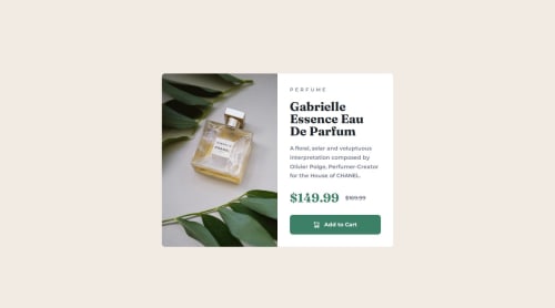
product-preview-card-component-main

P
Davy•320
@DavyZane
A solution to the Product preview card component challenge
View live sitePreview (opens in new tab)View codeCode (opens in new tab)

Solution retrospective


What are you most proud of, and what would you do differently next time?

I have no experience with responsive design. I watched Kevin Powell's video of doing this challenge, followed it step by step until I successfully completed this challenge myself. For the next challenges, I will reuse the techniques I just learned without any help - I hope.

What challenges did you encounter, and how did you overcome them?

The main difficulty encountered was that of responsive design, it is the first time that I use media queries. The second difficulty encountered consisted in coding dynamically so that each design detail adapts from one position to another. Example: the CSS function overflow: hidden; allows me not to force border-radiuses at the corners of the image, these being positioned in different corners depending on the size of the screen. Most of the tips I have learned come from Kevin Powell's video.

What specific areas of your project would you like help with?

At this level of difficulty I mostly need to practice, but any feedback is welcome 🙏.

Code
Select a file

Please log in to post a comment

Log in with GitHub

Community feedback

  • stephany247•730
    @stephany247
    Posted 8 months ago

    You’ve done a fantastic job stepping into responsive design for the first time! Following a tutorial to learn is a great approach, and it’s awesome that you applied concepts like media queries effectively to make your design adaptable across screen sizes. I’m especially impressed with how you handled image borders dynamically depending on the screen size—it shows that you’re already thinking about flexibility in your layouts.

    Moving forward, I’d recommend experimenting with fluid layouts using percentages or rem/em units to make your designs even more adaptable without relying too much on fixed values. You might also want to explore CSS Grid or Flexbox for even more control over the layout, especially for complex designs. Additionally, trying a mobile-first approach could simplify your process as it ensures that you prioritize the design for smaller screens first and progressively enhance for larger ones.

    It’s clear that you’ve learned a lot from this project, and I encourage you to practice future challenges without external help so you can strengthen your problem-solving skills. Great work so far, and I look forward to seeing how you build on these techniques in your next project!

    Marked as helpful

Join our Discord community

Join thousands of Frontend Mentor community members taking the challenges, sharing resources, helping each other, and chatting about all things front-end!

Join our Discord
Frontend Mentor logo

Stay up to datewith new challenges, featured solutions, selected articles, and our latest news

Frontend Mentor

  • Unlock Pro
  • Contact us
  • FAQs
  • Become a partner

Explore

  • Learning paths
  • Challenges
  • Solutions
  • Articles

Community

  • Discord
  • Guidelines

For companies

  • Hire developers
  • Train developers
© Frontend Mentor 2019 - 2025
  • Terms
  • Cookie Policy
  • Privacy Policy
  • License

Oops! 😬

You need to be logged in before you can do that.

Log in with GitHub

Oops! 😬

You need to be logged in before you can do that.

Log in with GitHub

How does the accessibility report work?

When a solution is submitted, we use axe-core to run an automated audit of your code.

This picks out common accessibility issues like not using semantic HTML and not having proper heading hierarchies, among others.

This automated audit is fairly surface level, so we encourage to you review the project and code in more detail with accessibility best practices in mind.

How does the CSS report work?

When a solution is submitted, we use stylelint to run an automated check on the CSS code.

We've added some of our own linting rules based on recommended best practices. These rules are prefixed with frontend-mentor/ which you'll see at the top of each issue in the report.

The report will audit all CSS, SCSS and Less files in your repository.

How does the HTML validation report work?

When a solution is submitted, we use html-validate to run an automated check on the HTML code.

The report picks out common HTML issues such as not using headings within section elements and incorrect nesting of elements, among others.

Note that the report can pick up “invalid” attributes, which some frameworks automatically add to the HTML. These attributes are crucial for how the frameworks function, although they’re technically not valid HTML. As such, some projects can show up with many HTML validation errors, which are benign and are a necessary part of the framework.

How does the JavaScript validation report work?

When a solution is submitted, we use eslint to run an automated check on the JavaScript code.

The report picks out common JavaScript issues such as not using semicolons and using var instead of let or const, among others.

The report will audit all JS and JSX files in your repository. We currently do not support Typescript or other frontend frameworks.

Oops! 😬

You need to be logged in before you can do that.

Log in with GitHub