Submitted almost 3 years agoA solution to the Product preview card component challenge
Product Preview Card Component Main

@dracowarz
Solution retrospective
Any feedback for me to improve this "Product Preview Card Component Main" challenge?
Code
Please log in to post a comment
Log in with GitHubCommunity feedback
- @YayoKB
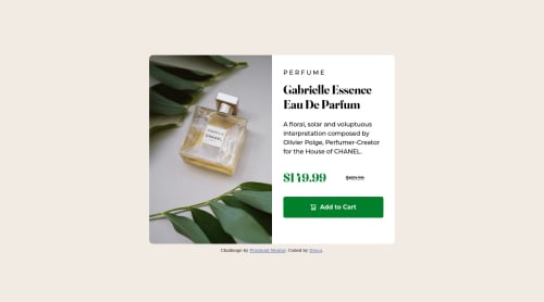
- The site is not responsive. There are two layouts, one for desktop/wider screens and one for phones/taller screens. Your site does not change the layout depending upon the screen width. Please do that.
- Some of your colours do not match exactly. The price and button should be a different green and the description and "PERFUME" label at the top should be in grey.
Marked as helpful - @fatlindshehu
Hi there,
Nice work you have done, here are my suggestions on how you can improve your component:
- The button color is different & it has a hover state (The color changes on hover)
- The attribution div is messing with your code when resizing
- On small screen sizes give the component a static height, right now the elements are floating out of the container.
Keep it going...
Marked as helpful


Join our Discord community
Join thousands of Frontend Mentor community members taking the challenges, sharing resources, helping each other, and chatting about all things front-end!
Join our Discord