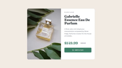
Product preview card component mobile-first responsive with Bootstrap

Solution retrospective
I'm most proud of finally using Bootstrap to create a responsive layout, which made the process much faster and easier than coding all the CSS from scratch. Also, I'm happy I finally got to use a mobile-first approach; it made me focus on the core content first.
What challenges did you encounter, and how did you overcome them?One of my biggest challenges during this project was mastering the use of media queries to create a truly responsive design. While I had some prior experience with media queries, this project required me to think more critically about how the layout and elements should adapt to different screen sizes. I spent a lot of time experimenting with different breakpoints and CSS properties to ensure that the product preview card looked great and functioned flawlessly on everything from small mobile devices to large desktop monitors. It was a valuable learning experience that significantly improved my skills in responsive web design
What specific areas of your project would you like help with?I'm open to constructive comments and feedback on any part of my page!
Please log in to post a comment
Log in with GitHubCommunity feedback
No feedback yet. Be the first to give feedback on Leyanis Díaz's solution.
Join our Discord community
Join thousands of Frontend Mentor community members taking the challenges, sharing resources, helping each other, and chatting about all things front-end!
Join our Discord