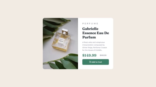
Product Preview Card Component - Mobile-First Solution

Solution retrospective
This was my first project that I consciously tried to approach with a mobile-first design workflow. After finishing the mobile design, I was surprised at how easy it was to get the desktop design working properly with a media query. I also challenged myself by incorporating a little CSS Grid where I would normally be more comfortable with Flexbox.
I had some trouble getting the image to display properly. It took a lot of trial and error. I got it working, but I still don't fully understand why the properties I used worked the way they did.
I ended up using a container div and a background-image property with the image URL (using a media query to change it between desktop/mobile). I used "background-size: cover" and "background-position: center top". Do these properties make sense here or is there a better way to set up the image for this project?
Please log in to post a comment
Log in with GitHubCommunity feedback
No feedback yet. Be the first to give feedback on ryangholland's solution.
Join our Discord community
Join thousands of Frontend Mentor community members taking the challenges, sharing resources, helping each other, and chatting about all things front-end!
Join our Discord